Type
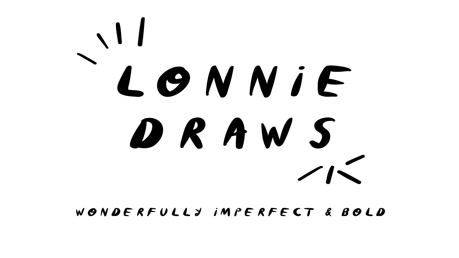
My handwriting, turned into a font, drawn one letter at a time before 5:30am while I was in chemo.
During chemo there were days my hands just did not work. Not during treatment, and not for whatever was left of that day. The IVs blocked my arm movements. Nausea sat on top of that. The sleeping meds in my IV bag made it hard to stay awake too, which was fine, my body needed the rest. No complaints there. But downtime does't feel like much of a gift when I couldn't use my hands.
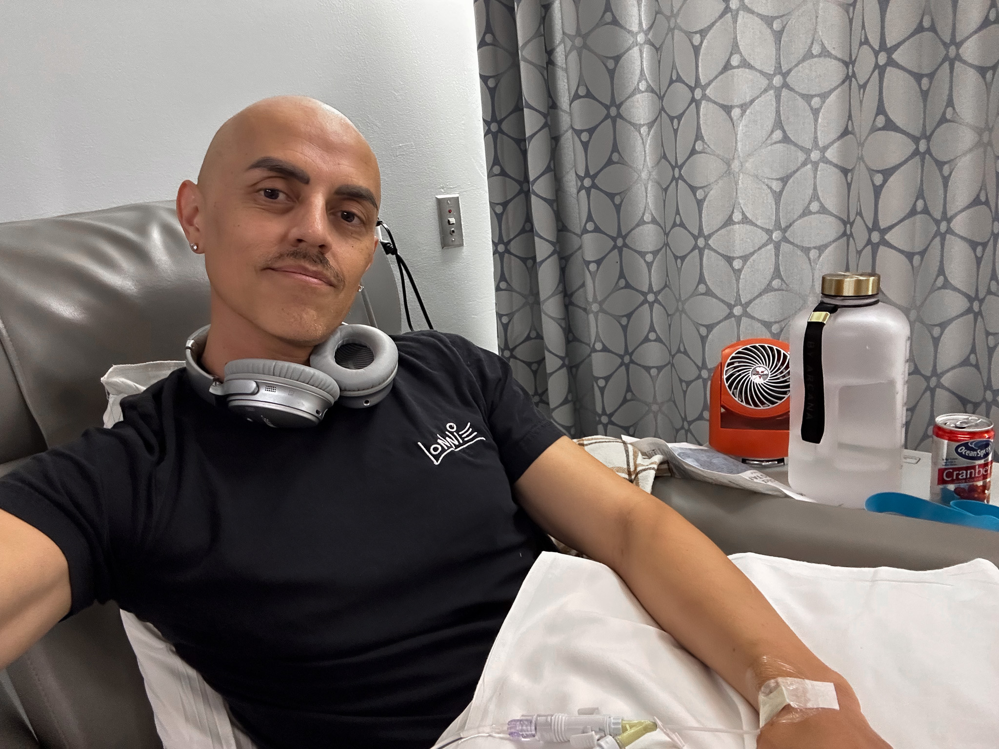
An actual Tuesday, mid-infusion.
So I started getting up at 5:30am, before the day could take anything else from me. Treatment ran 8am to 4pm most weekdays. On good days, someone took me to a park after. On bad days, I slept another few hours. But the mornings were mine. My hands were still in my control before all of that started, so I drew letters instead.
It went slow at first. One letter turned into 4. 4 turned into a whole alphabet. The alphabet turned into a font, with a pile of whimsical little symbols rolled in.
Truth is, I wanted to make a font before any of this. Chemo didn't give me the idea. But it did give me the time.
The bigger reason I kept showing up every morning wasn't really about the font, though. Shaky hands are a known side effect of chemo, and I was scared. Scared of losing my dexterity. Scared of losing control of my hands as a professional artist and designer. Could this be it for my career? There were so many unknowns during chemo. So much was out of my control.
So I drew. Every single day. Partly to make something. Mostly to check. Was my hand steady today? Was the shakiness getting better, or worse? Drawing letters was the most honest way I had to find out. And I wanted to be the first to know if anything shifted.
Fortunately, my hands don't shake anymore. But the font is intentionally wild and loose, because that's all I could manage back then. I didn't have precise control over my own hands. That's where the wildness started.
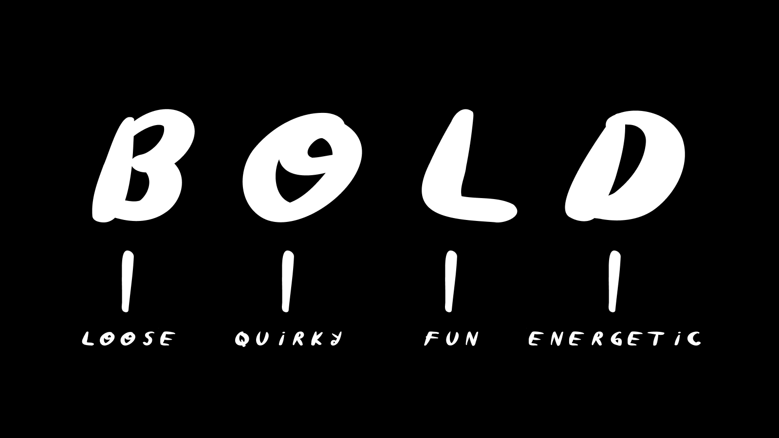
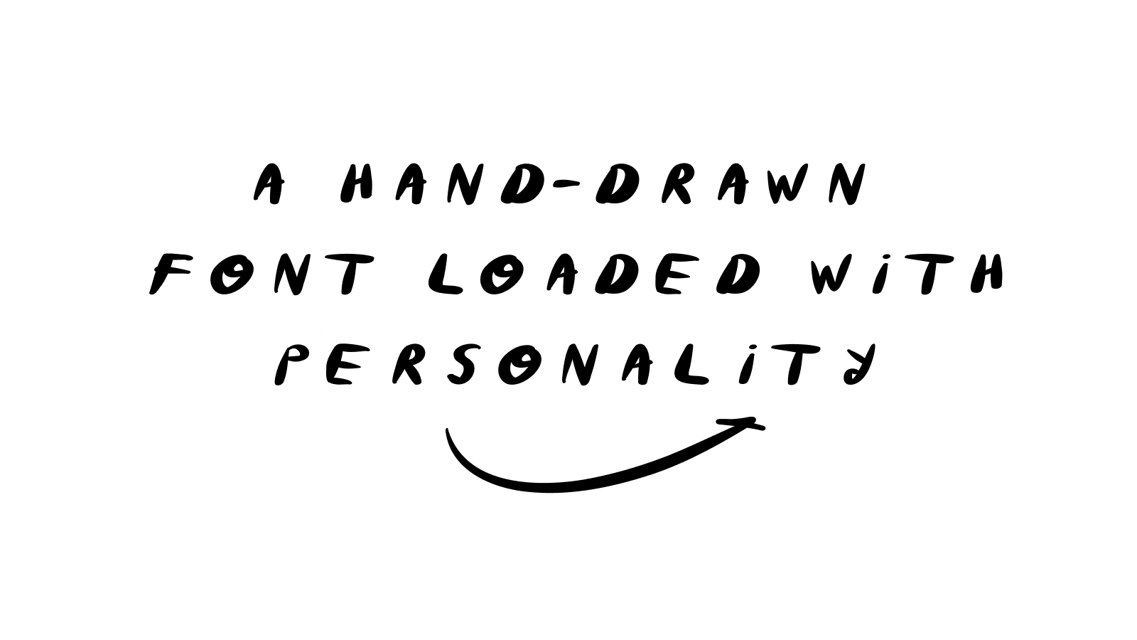
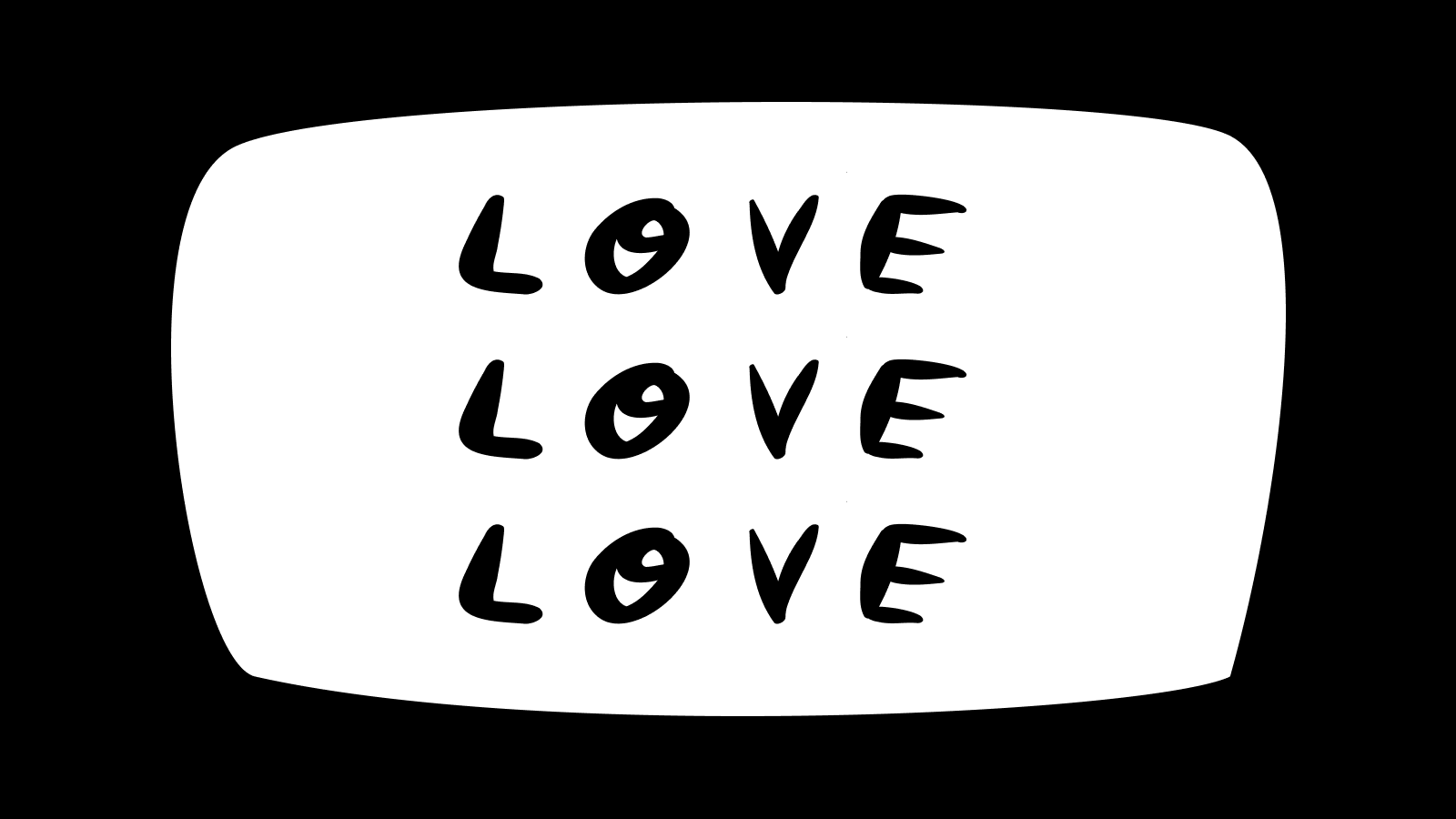
Now that's just what the font feels like. Energetic. A little untamed. Handmade. These days, it mostly lives in my newsletters and social media posts.
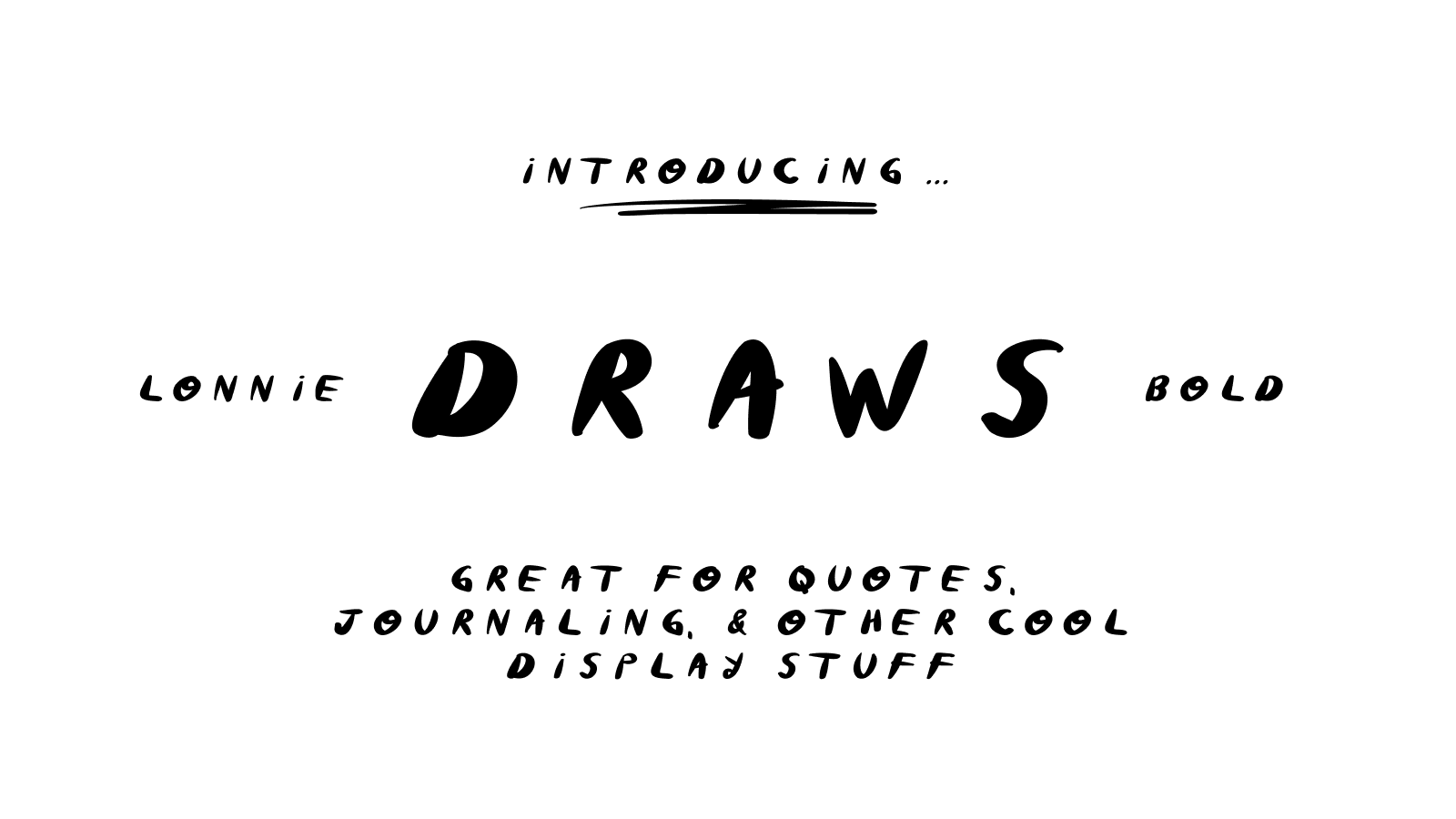
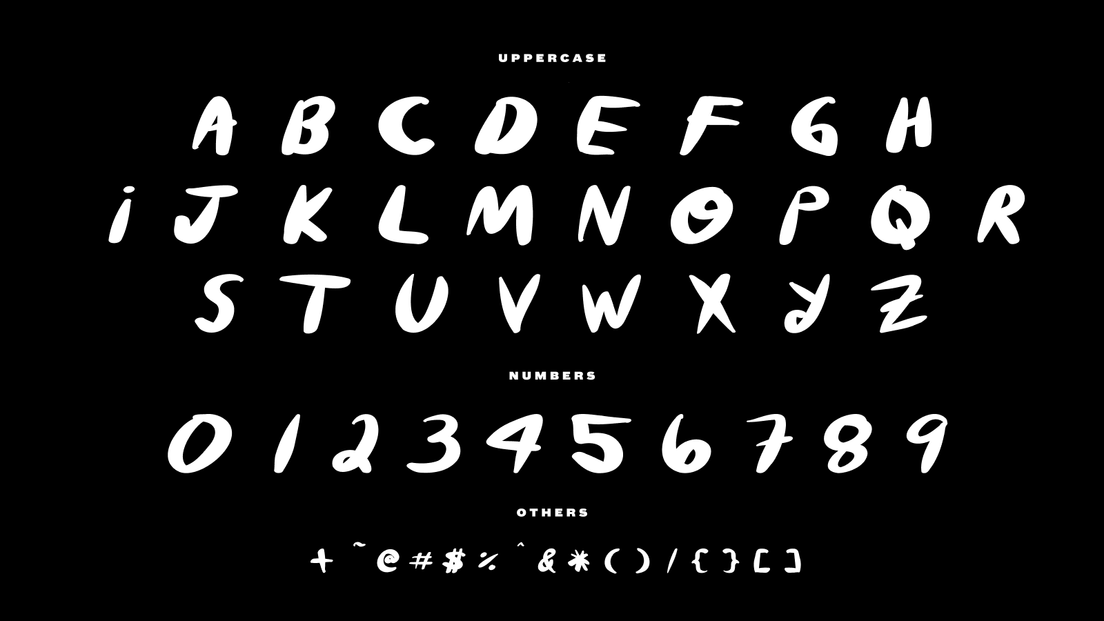
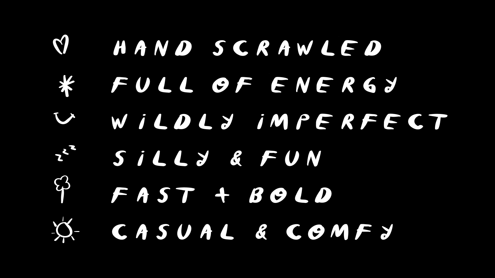
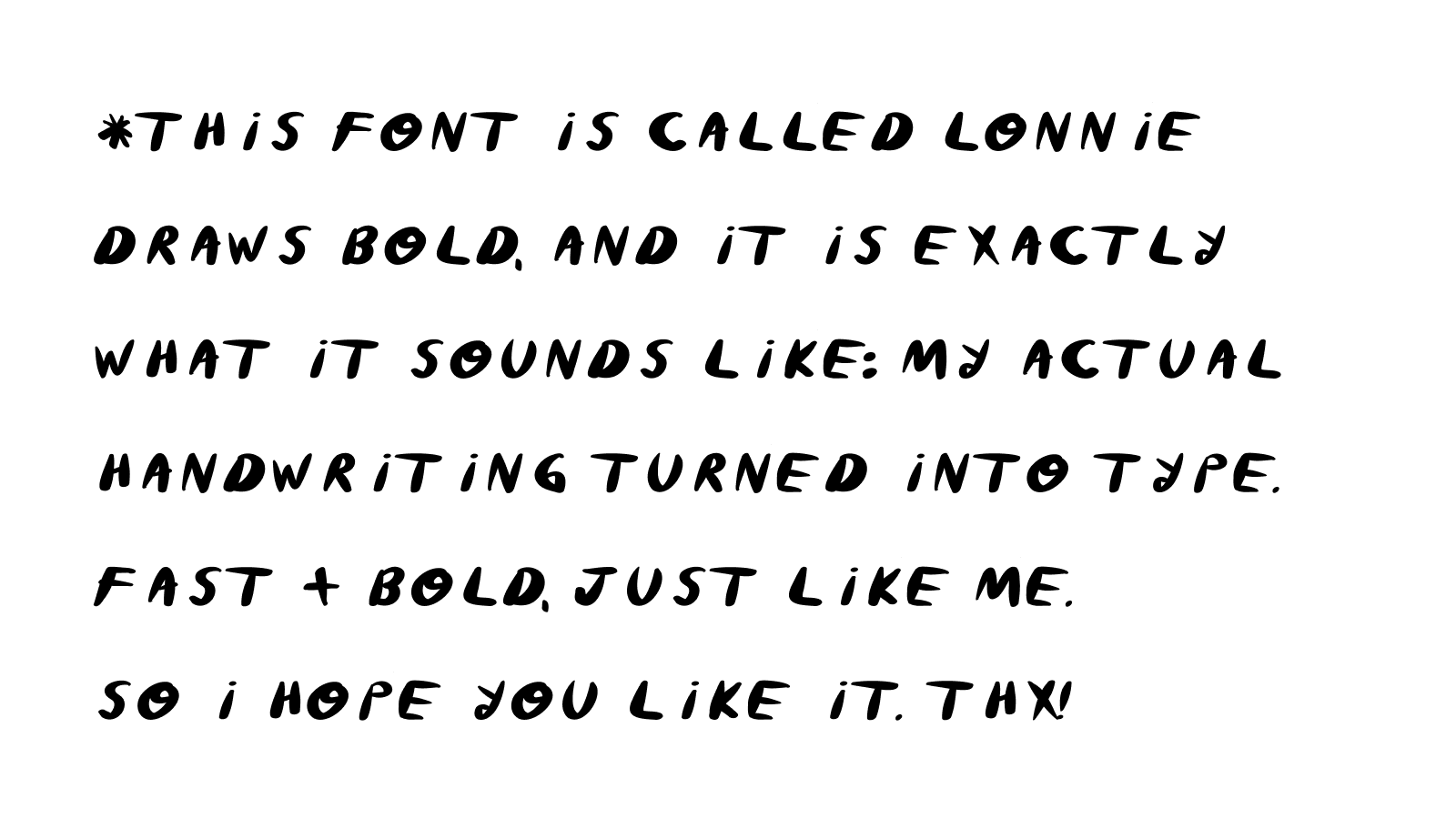
This one's called Lonnie Draws Bold, and it's exactly what it sounds like: my actual handwriting, turned into type. I used to hand letter every headline on my Substack, one at a time, for every single post. I still love the hand drawn stuff. But I wanted the speed and the consistency without losing what makes it look like me, so I built a font instead of redrawing the same letters over and over.
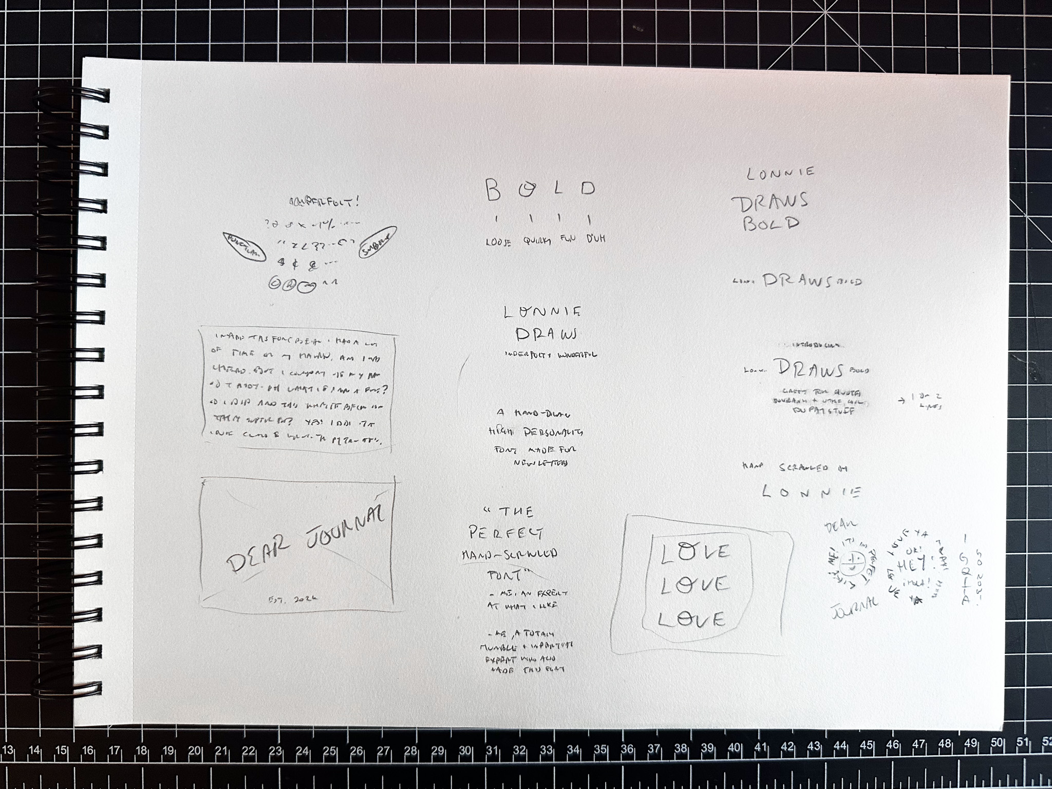
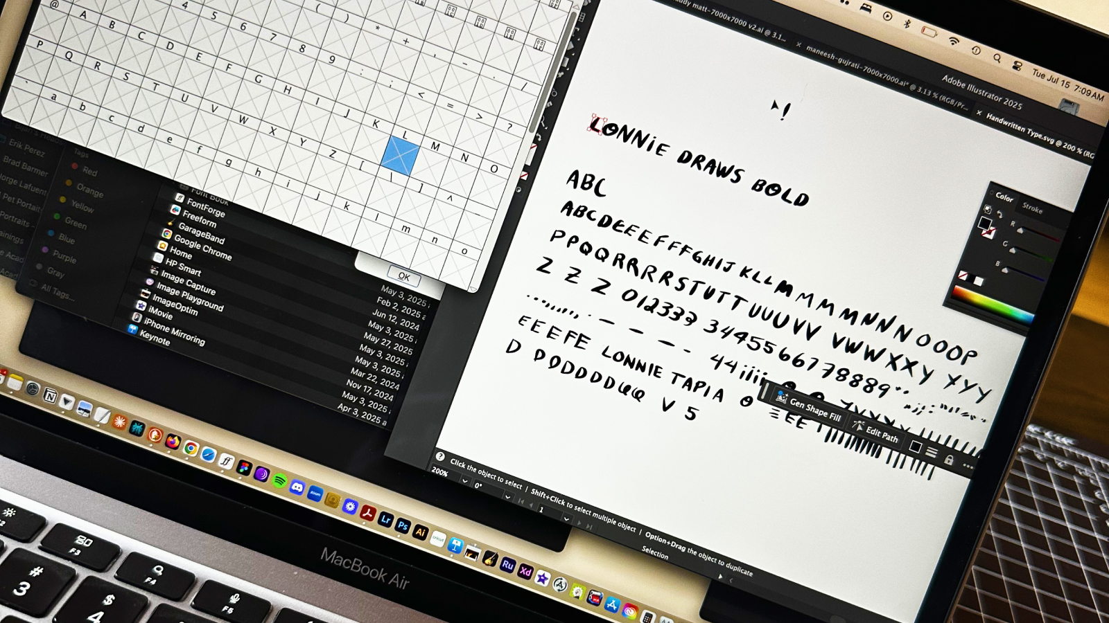
Making something like this, even with digital tools speeding up the process, still takes a real amount of time. Every letterform gets drawn, cleaned up and sized perfectly. Then measured up against the set. I didn't want to take any shortcuts creating that part.
Download this font on Gumroad. For other custom font projects contact me.
Now it's just part of how I work. Headlines on my writing in Substack. The intentions I set. It's also the font on my memo board, still done by hand. To do lists, grocery lists, quotes I want to remember. It's fast. It's bold. It's me.
I think of this font as a gift from my past self. The version of me who had the gift of time, and the foresight to hand it forward.