Branding & Strategy
Building the first automated lending platform for the cannabis industry.
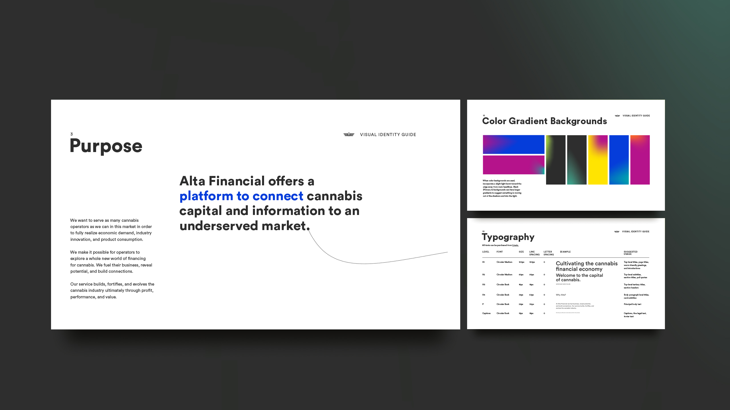
Cannabis operators in the United States face a structural problem: federal prohibition and regulatory complexity make traditional financing nearly inaccessible. The founders of Alta Financial came with a solution, a SaaS platform connecting licensed cannabis operators with cannabis-friendly lenders, and needed a brand and market presence to match its ambition. I led the founding team through the full build, from brand strategy and visual identity through website design, launch activations, and a content system to educate and convert both sides of the marketplace.
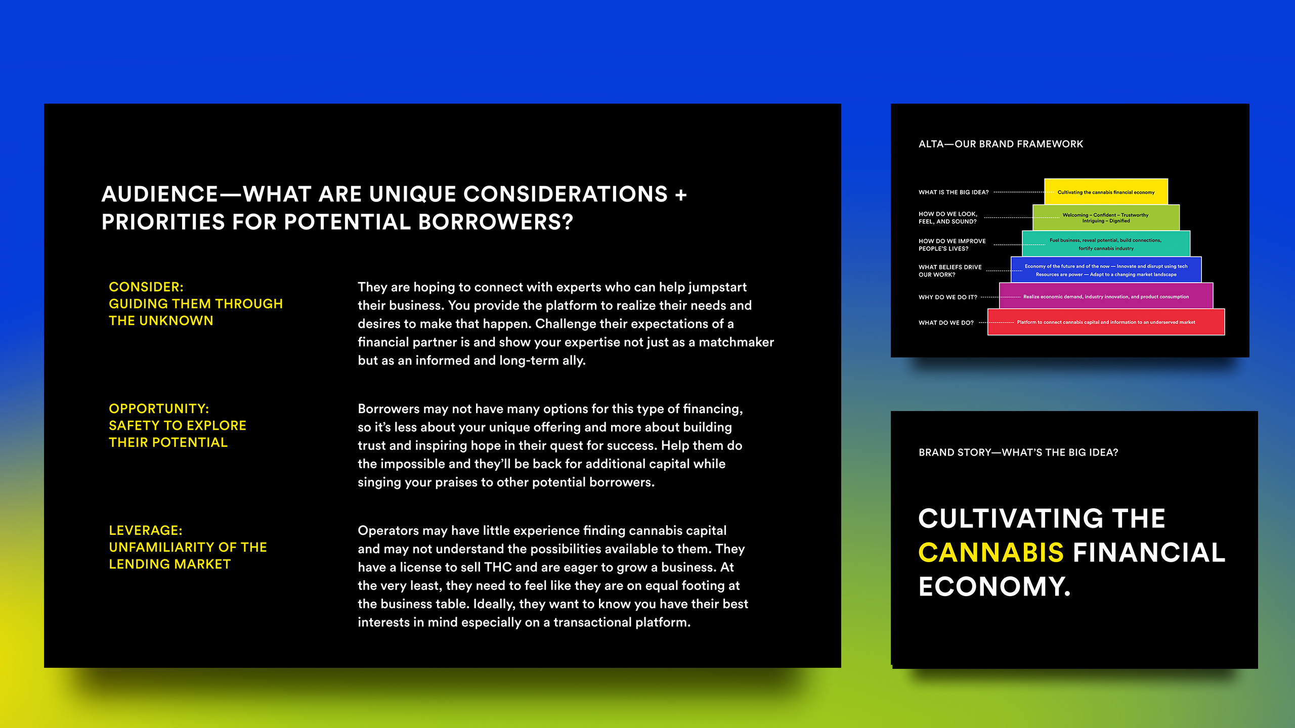
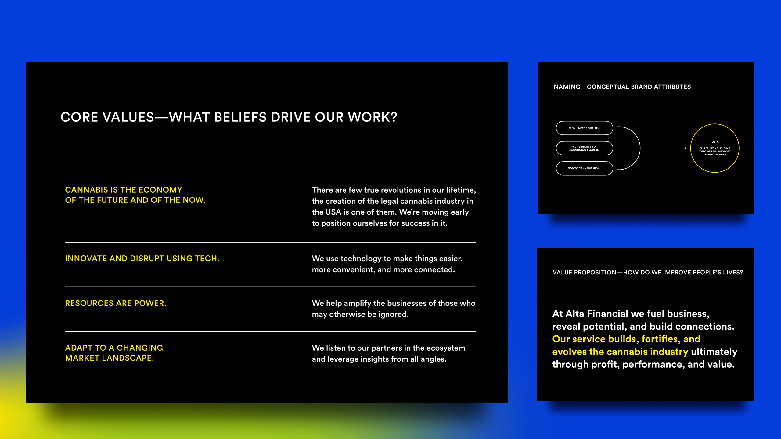
I led the founding team through a series of co-creation workshops designed to surface team truths and align on a shared trajectory. Sessions were conducted remotely to accommodate the global team during COVID lockdowns. The workshops produced a clear picture of the opportunity. Cannabis operators often lack experience navigating cannabis capital markets and need to feel like credible counterparts in a financial transaction. Lenders, in turn, need access to qualified deal flow suited to the specific requirements of the industry. From that foundation, I developed positioning statements, core values, audience definitions, and a brand pyramid that brought the company's offering, purpose, and value proposition into a single, navigable framework.
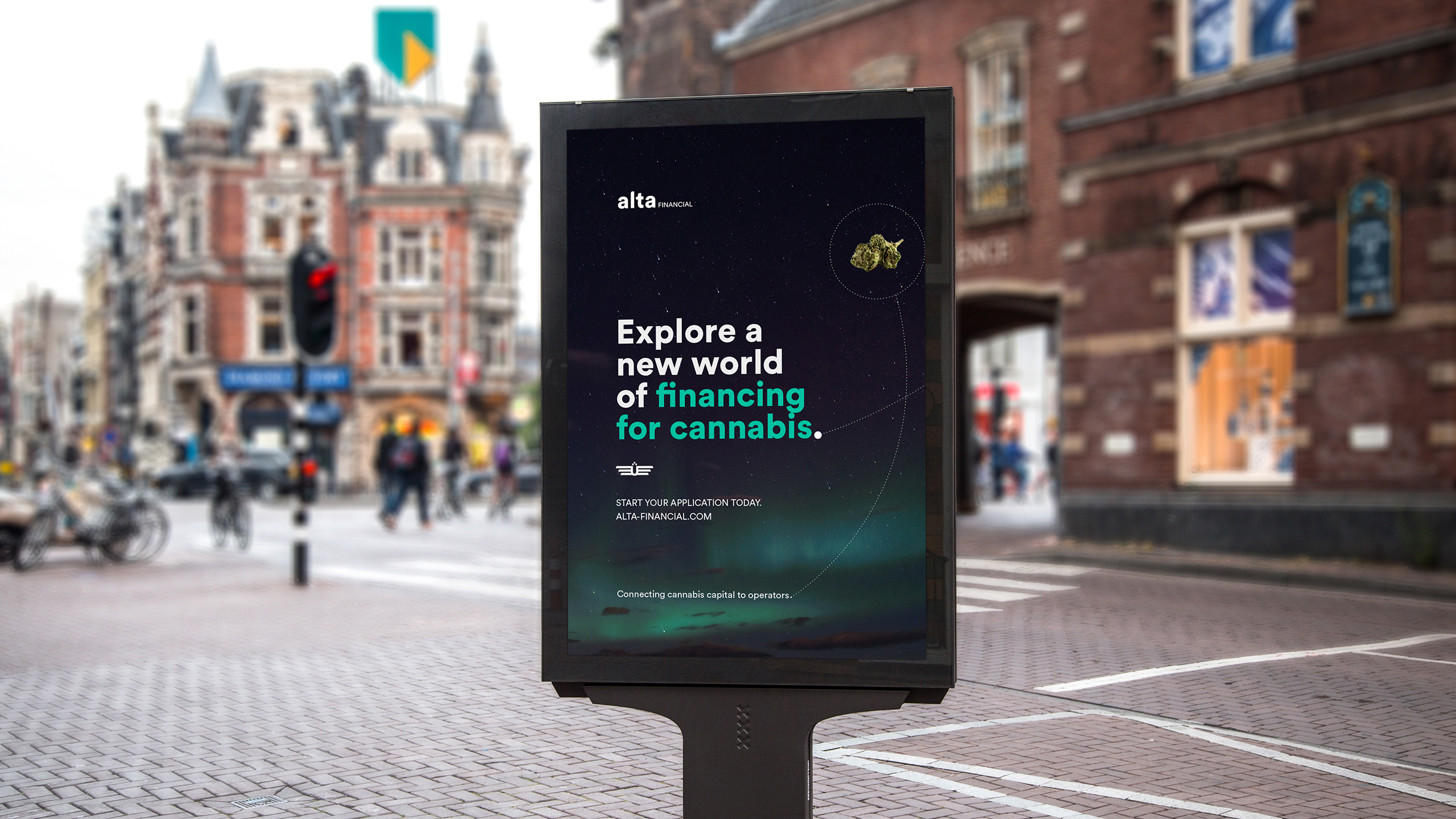
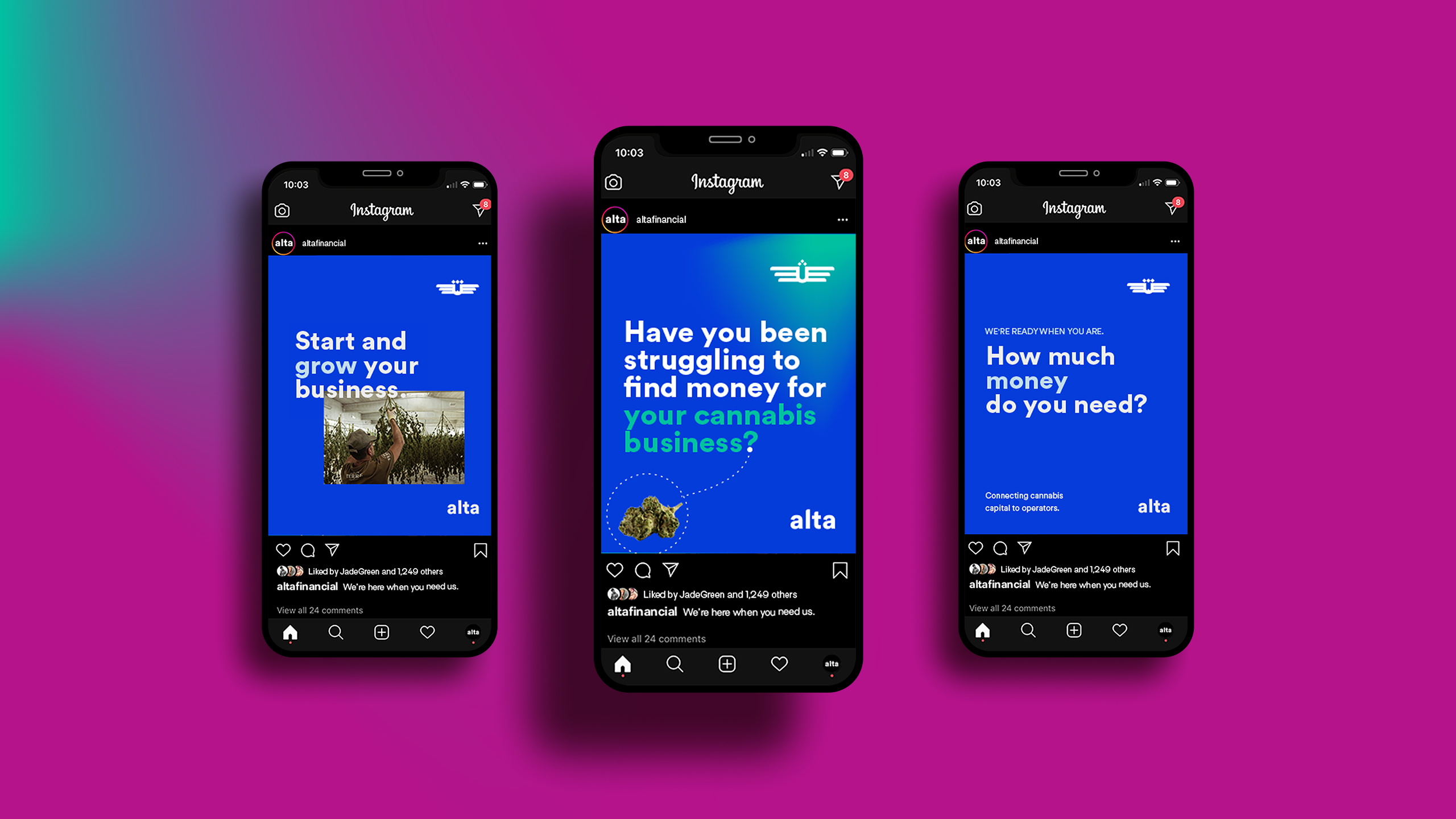
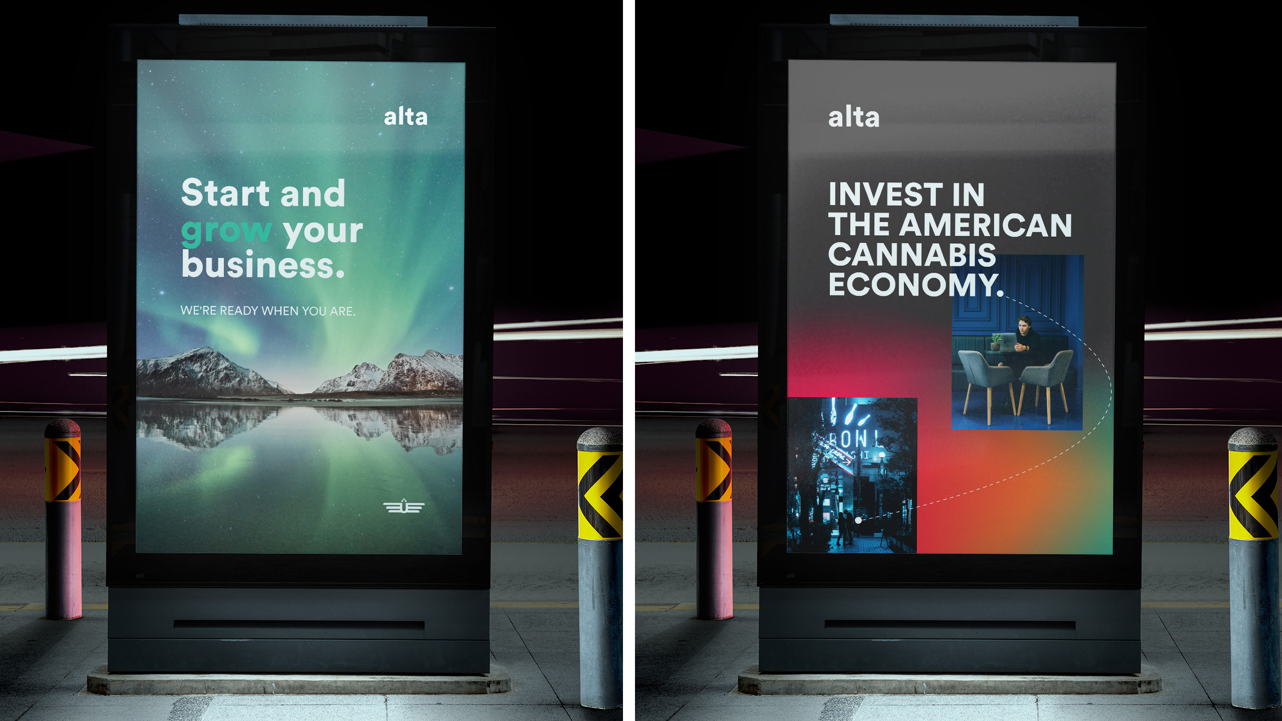
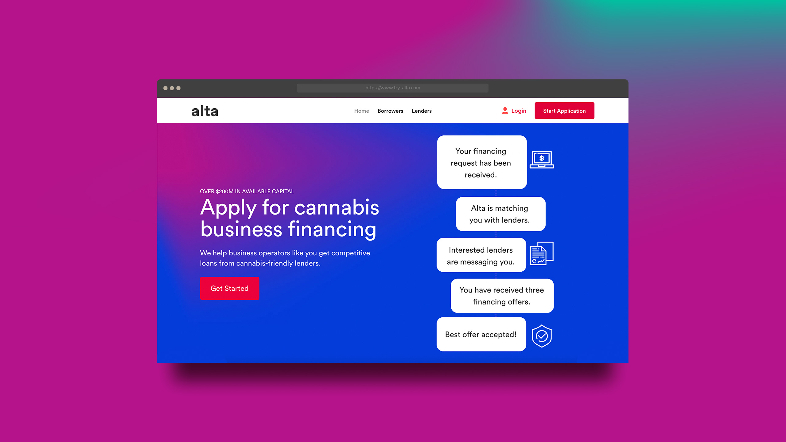
The visual and messaging strategy was built around the idea of a New World. The concept drew from the language of exploration: destinations, flight paths, the shift from darkness into light. Influenced by space travel posters and science fiction book covers, the identity was designed to signal confidence and credibility in a market still carrying significant stigma. Gradients, planetary photography, and dawn imagery reinforced the idea of bringing clarity to a historically underserved industry.
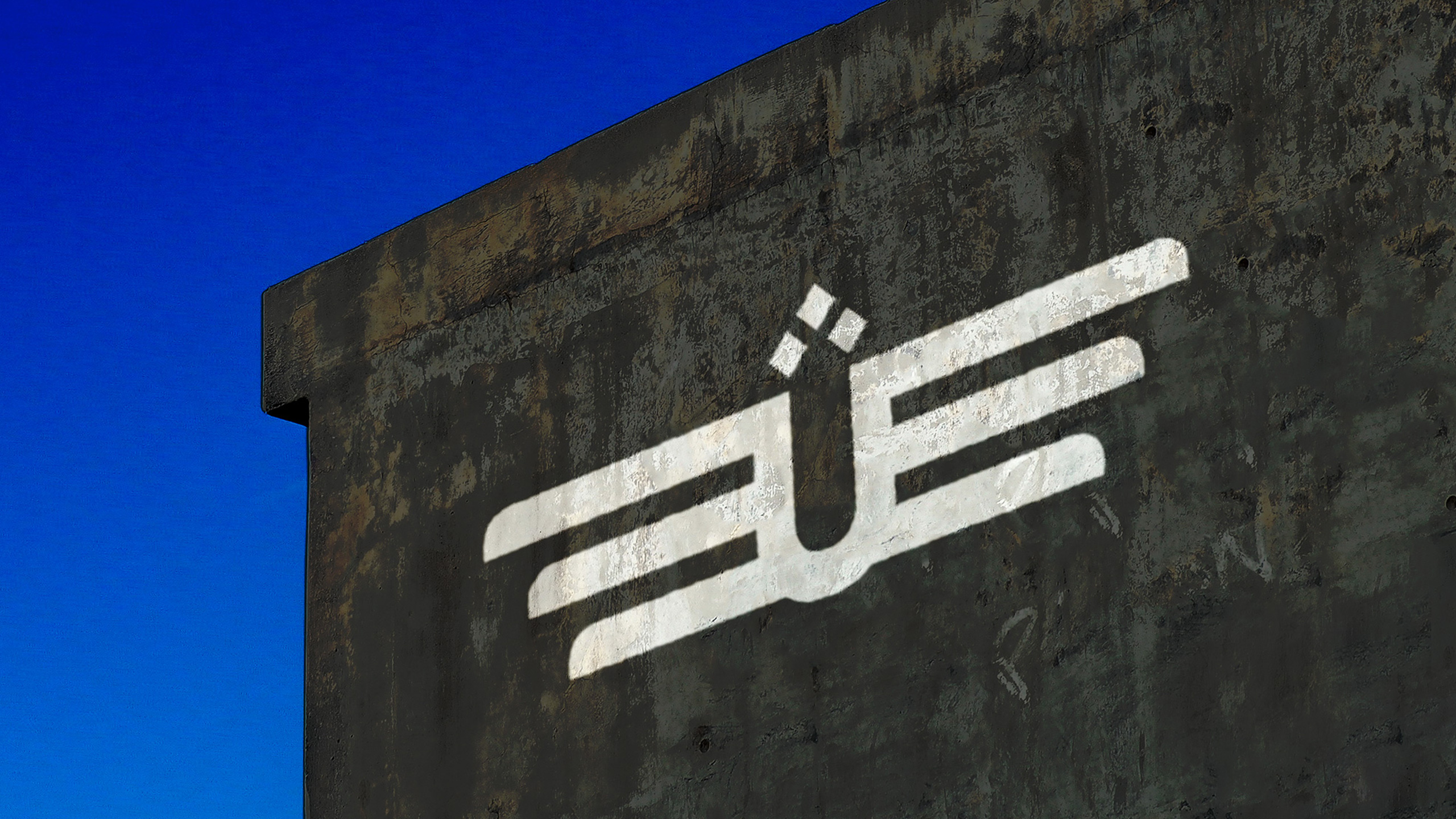
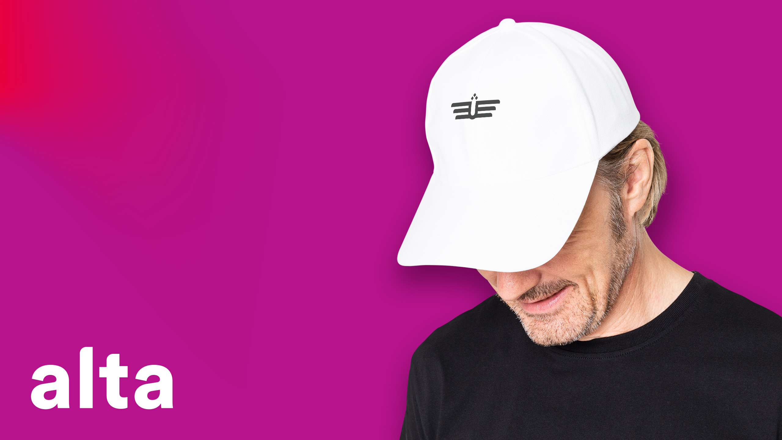
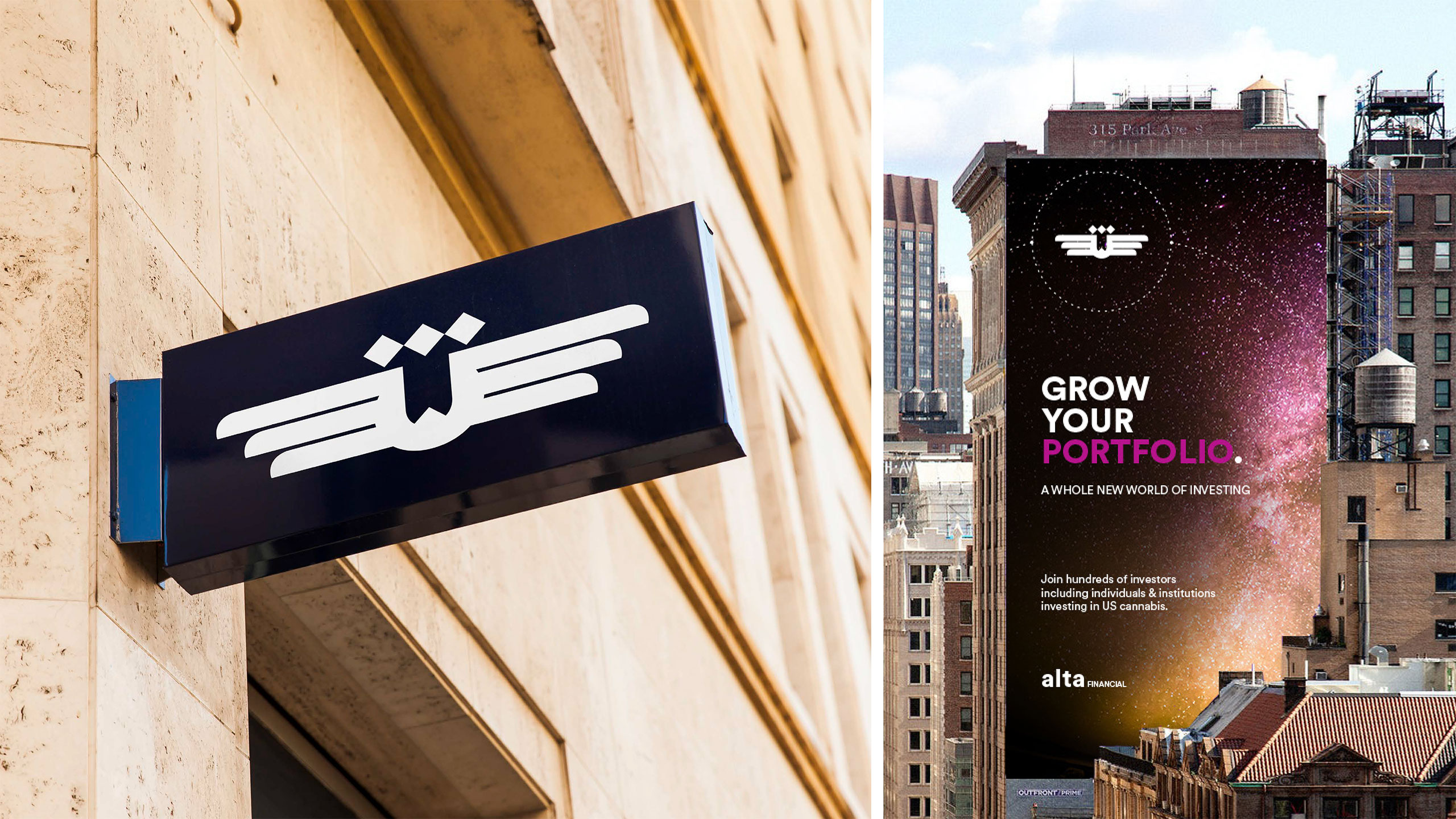
The Alta wordmark and icon are built around two symbols: the wings of a Griffon vulture, the highest-flying bird on record at 37,000 feet, and a crown representing authority and domain. The wordmark echoes the visual language of the wings through curving ascenders. Each business arm of the platform can be paired with the wordmark in a two-line lockup, aligned to the height of the lowercase a in Alta.
Color does the heavy lifting. Bright gradients emerge from shadow and expand into light, reflecting the platform's core promise. Headlines are warm and commanding. Photography spans vast, planetary scales. Together, the system signals a new world of possibility while maintaining the credibility a financial audience requires. A brand device drawn from travel maps and flight paths, a dotted line that can contain, connect, or indicate, provides flexible structure across applications.
You have been amazing. The partners and I are so impressed with your organization, communication, your understanding of our platform, your presentations, and the design deliverables. I have never been through a process like this and it has been incredible to experience.
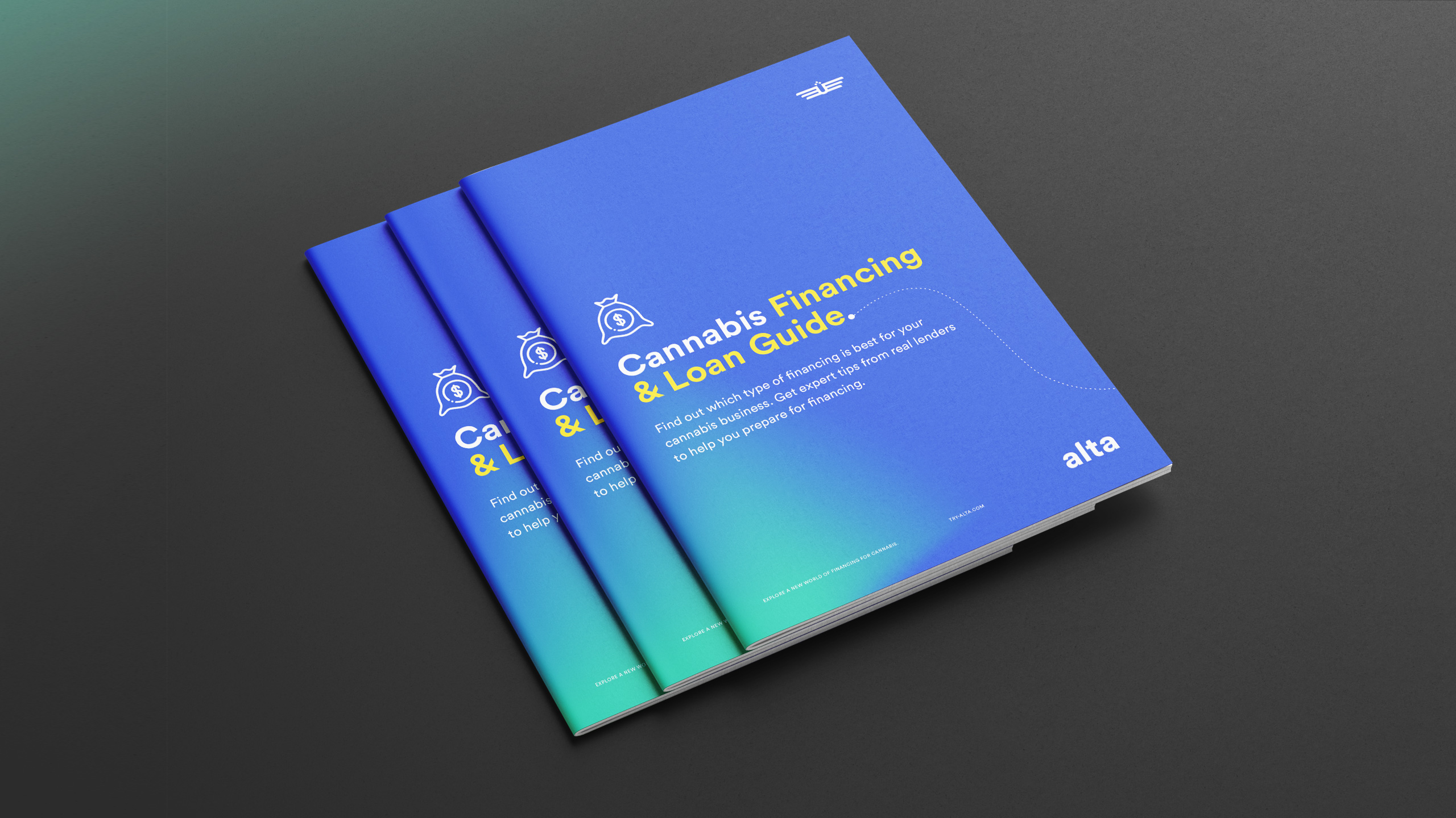
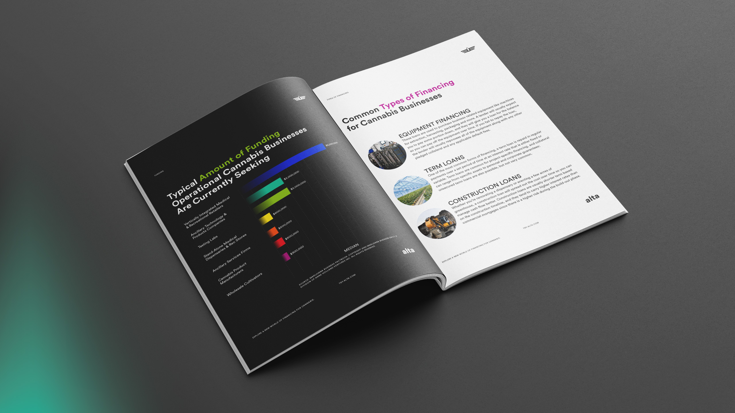
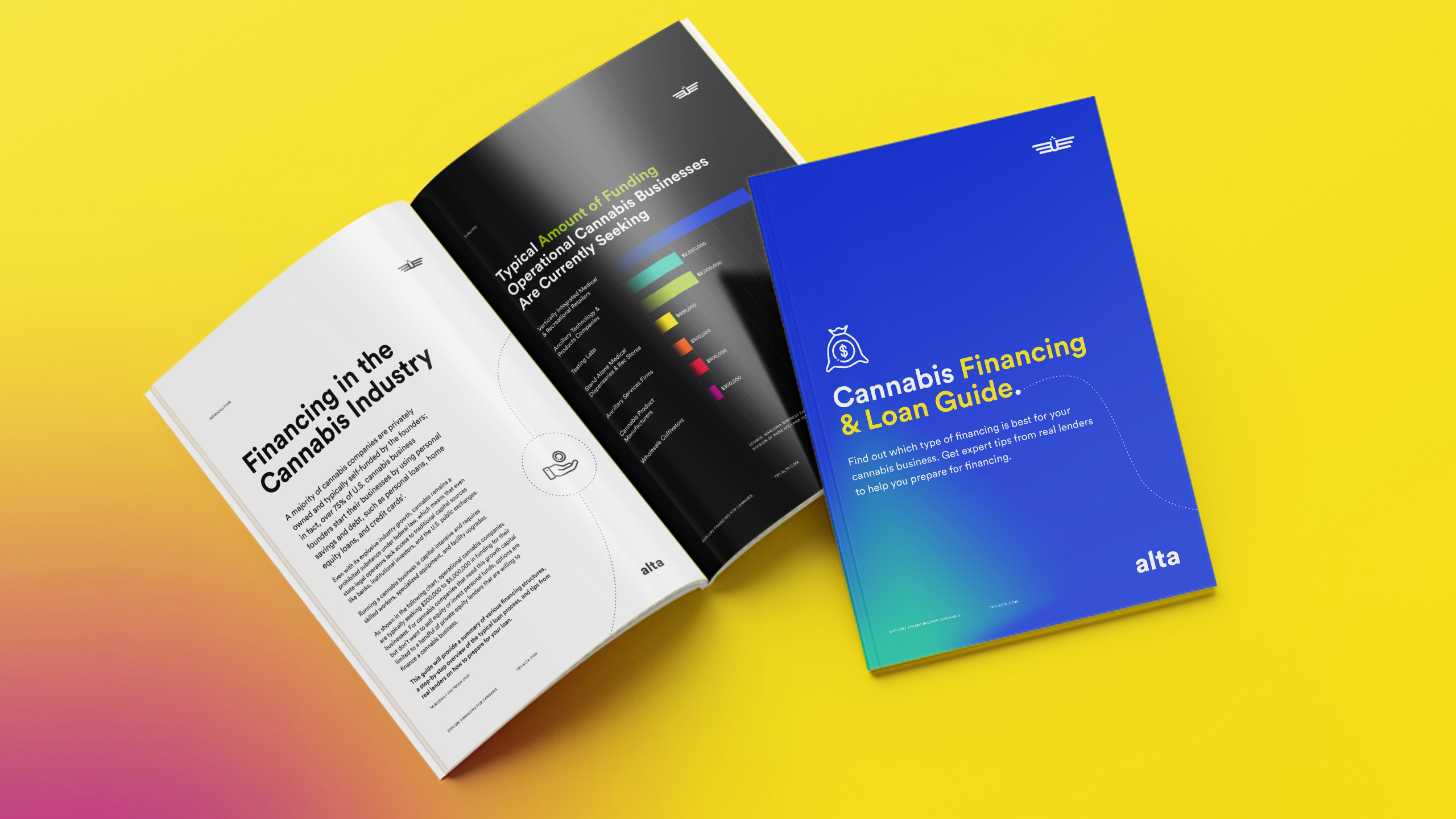
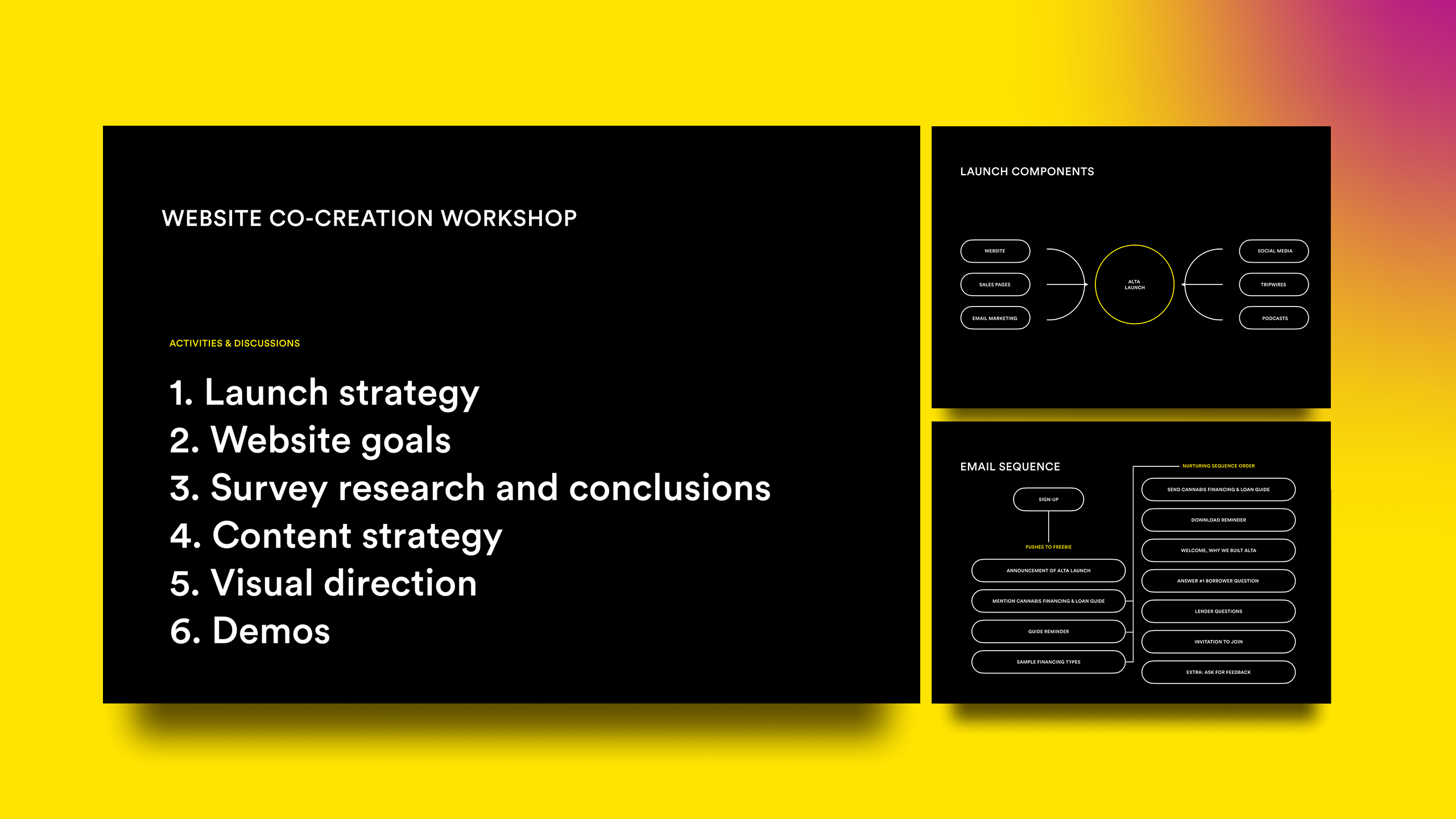
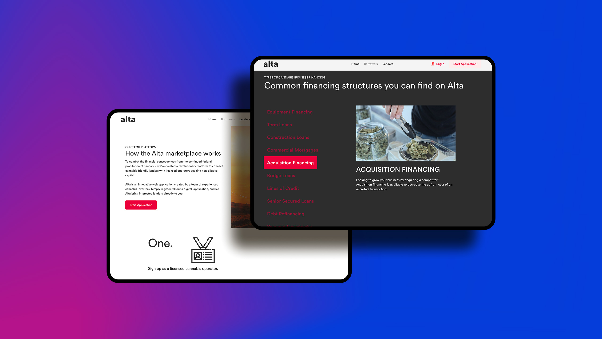
I led an additional series of design sprints focused on the website and launch strategy. Workshops surfaced actionable goals, shaped content strategy, and produced a site paired with an email nurture series designed to move both operators and lenders through the funnel. The email series drove traffic to a free guide that educated operators on lending requirements, encouraged applications, and helped candidates self-qualify before applying for funding.
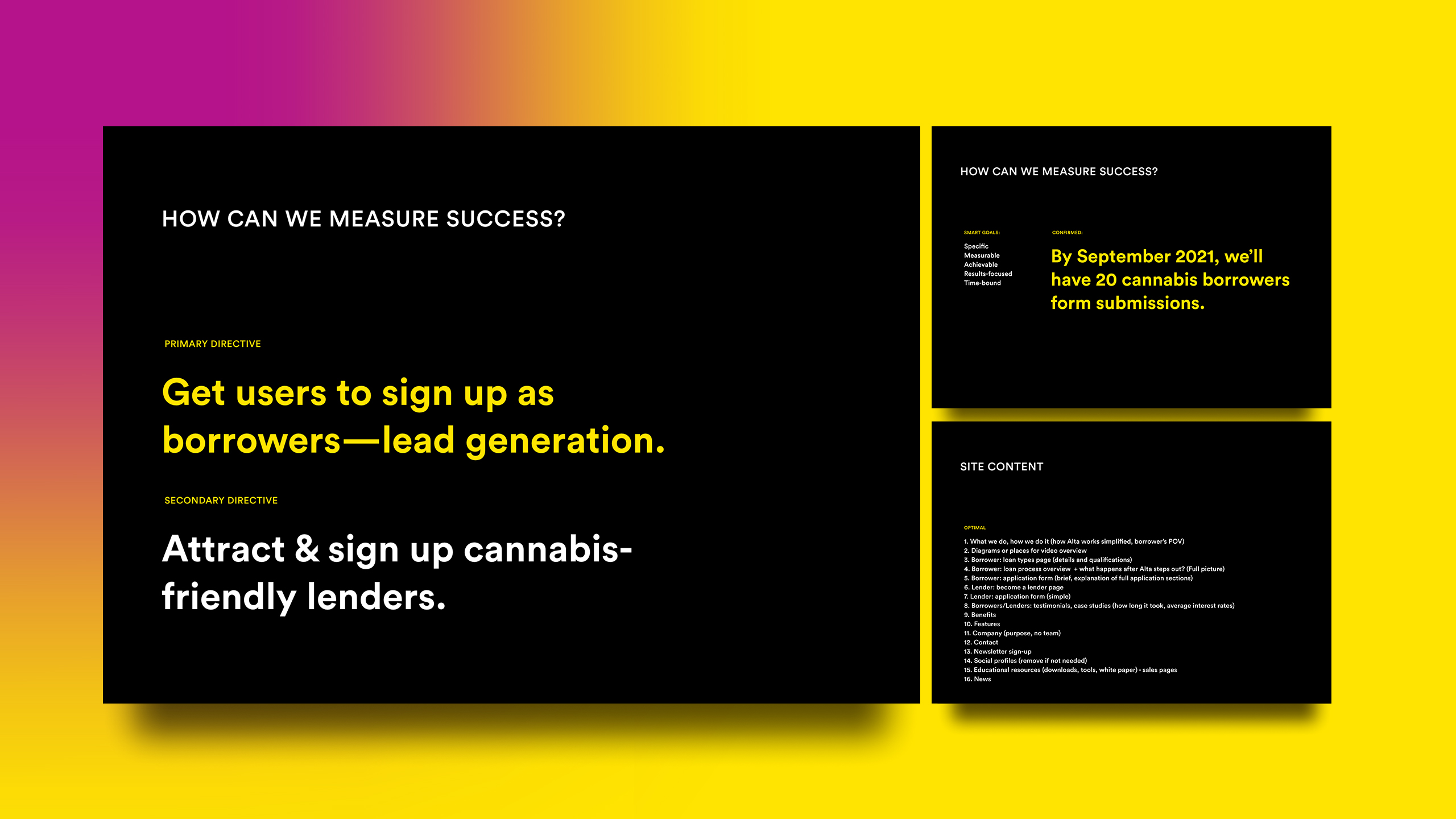
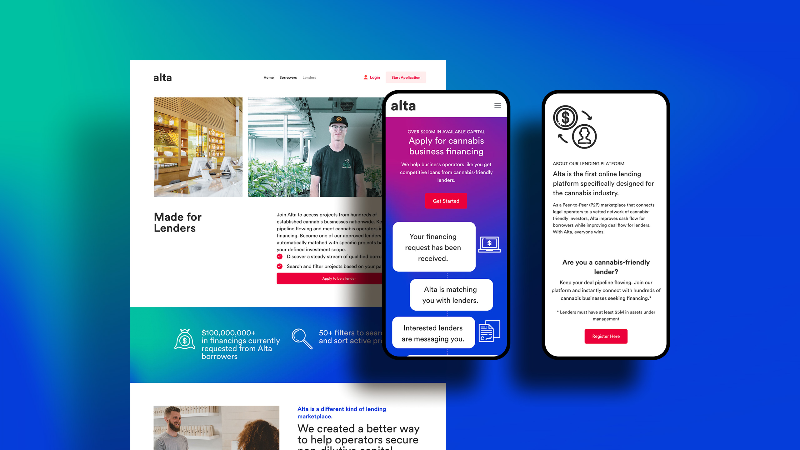
The platform launched with a goal of attracting 20 qualified operators in its first month. The site approved 35 projects. The platform now holds over $200 million in available funding.