Branding & Identity
Building a brand for the highest highs in life.
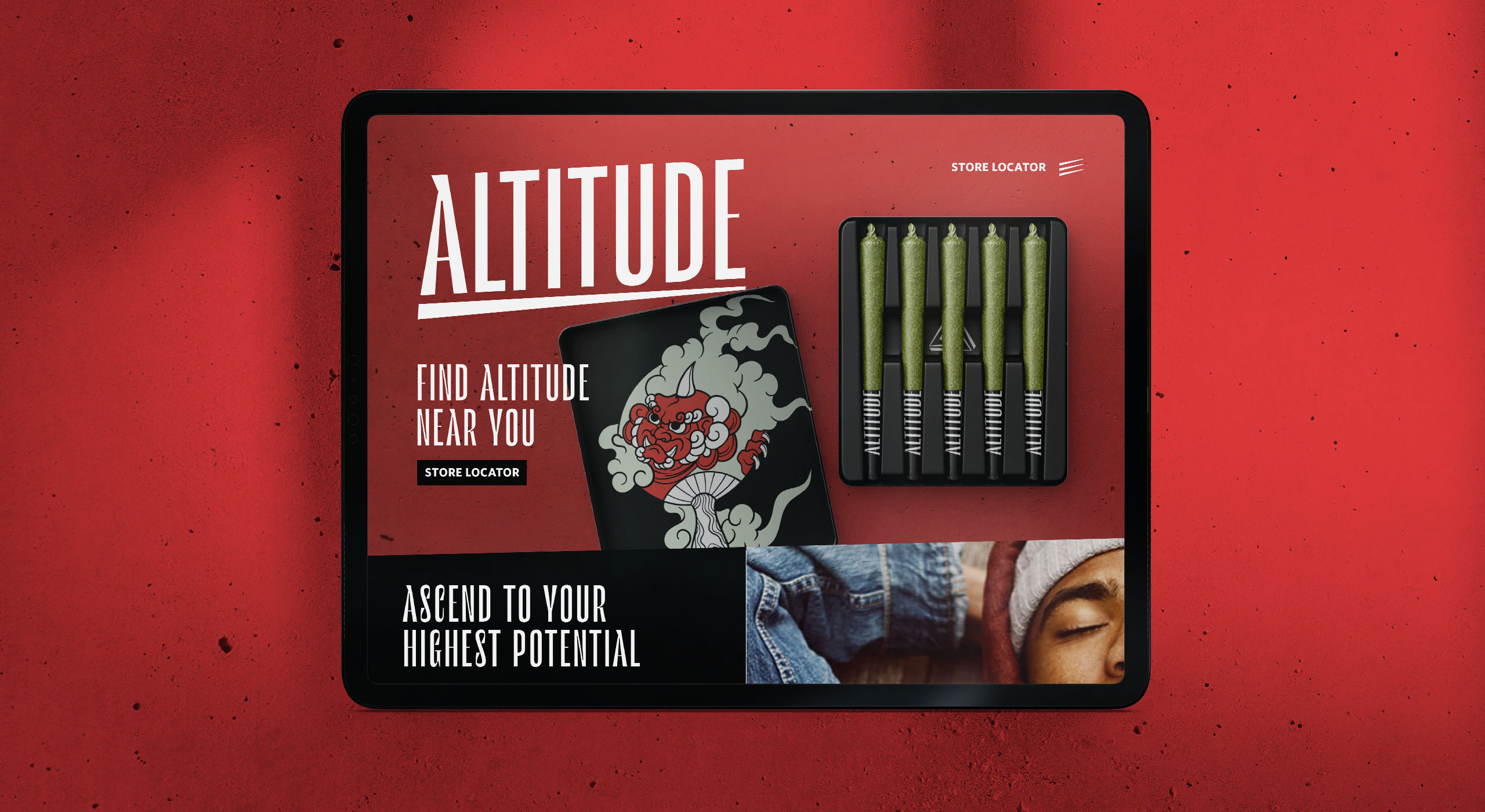
Five founders brought a focused challenge: build a brand as potent as the product. Altitude isn't just a premium cannabis line. It's a community platform for urban enthusiasts on a shared pursuit of the highest highs in life. From the start, the visual identity needed to feel active, playful, and elevated. I built a comprehensive visual and messaging system spanning packaging, signage, social media, the website, and budtender tools.
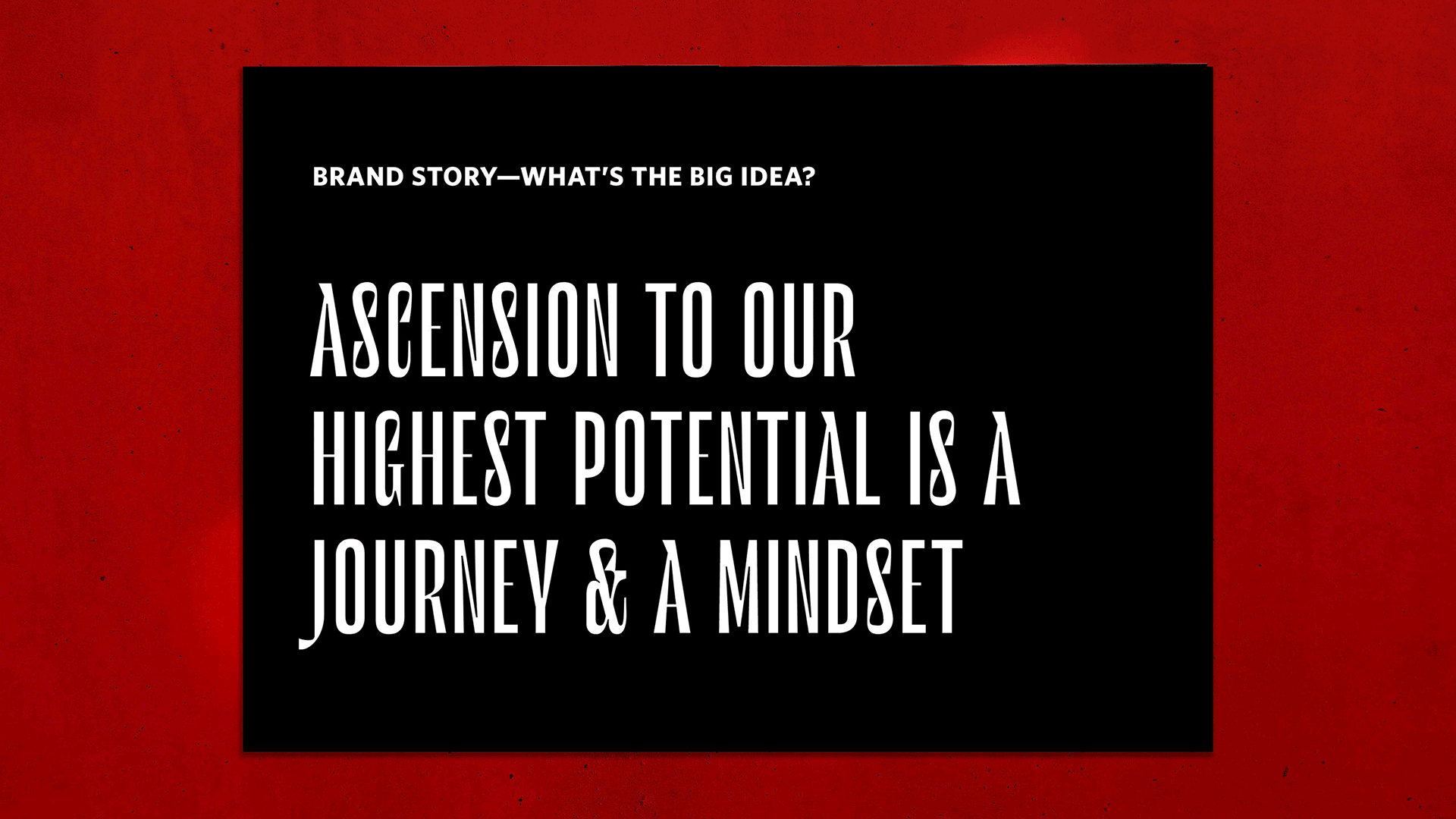
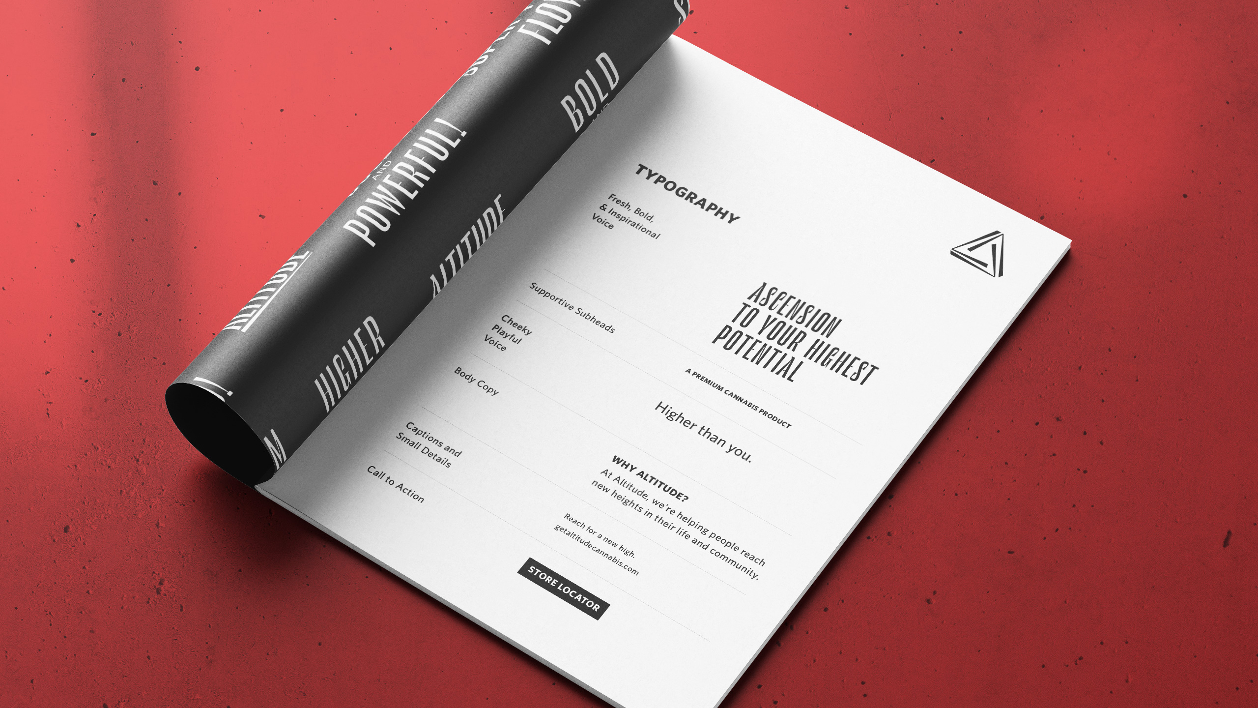
I led the founding team through five structured design sprints: Research & Discovery, Strategic Exploration, Brand Design, Website Strategy, and Refinements. Each sprint paired survey analysis with hands-on co-creation workshops. The output from each session built directly on the last. Cumulatively, the work produced audience profiles, brand DNA, naming attributes, voice guardrails, a brand pyramid framework, core values, and a unifying brand idea.
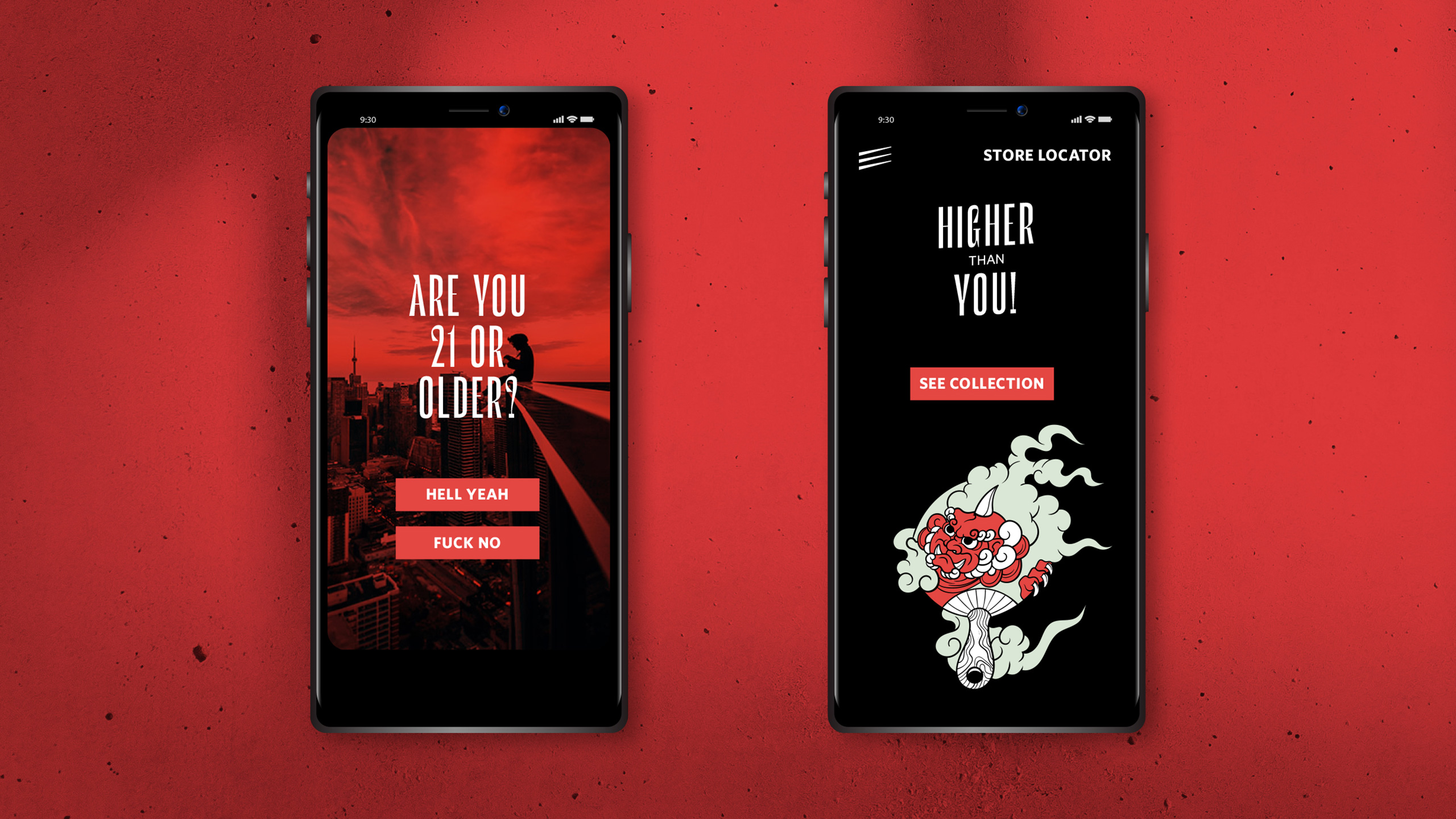
Visual testing during the design sprint produced a direction that was confident and unambiguous. The product takes center stage, with packaging details surfaced to reward attention. Even the first interaction, an age gate prompt, establishes the brand's tone before a single product page loads.
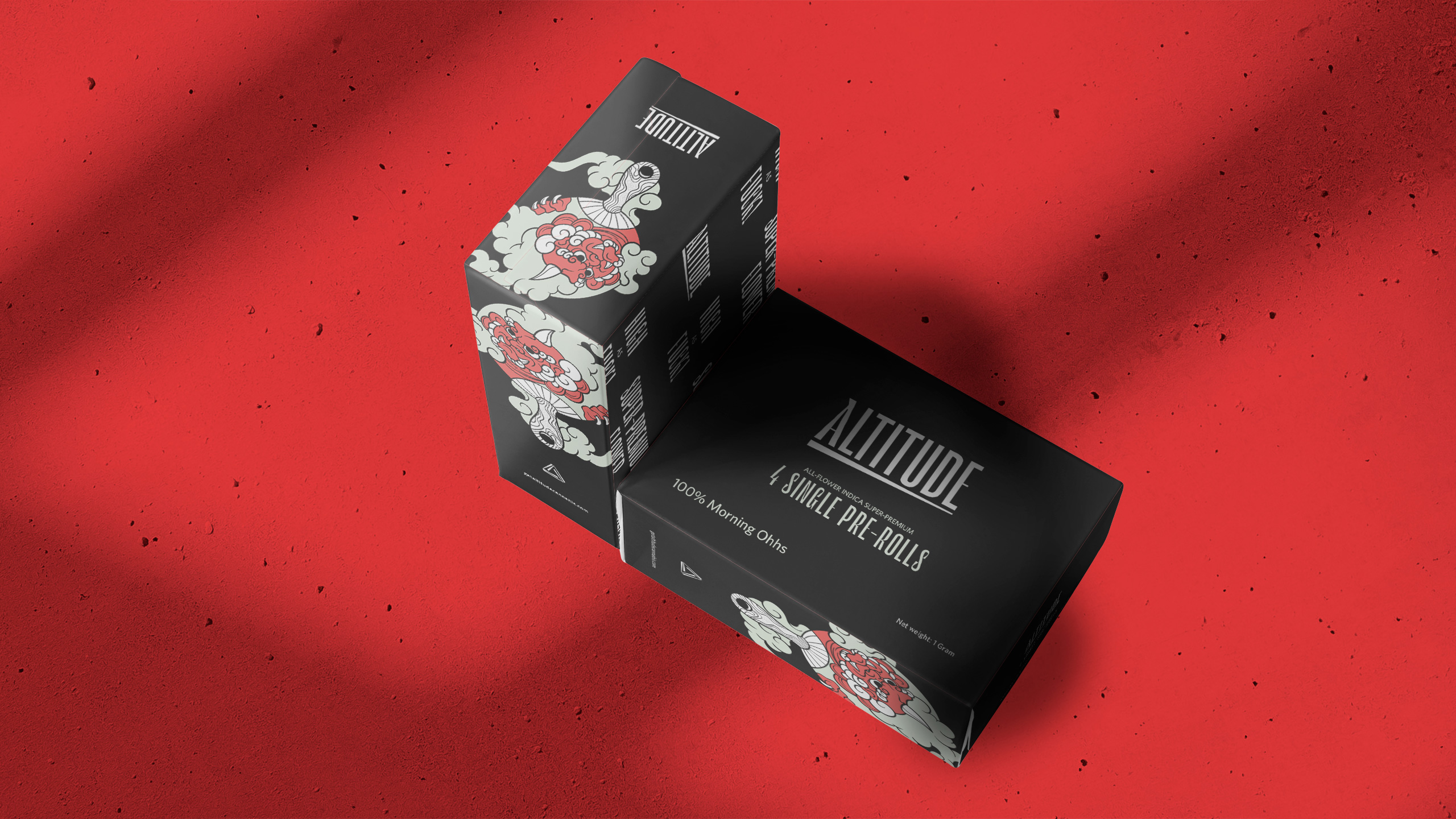
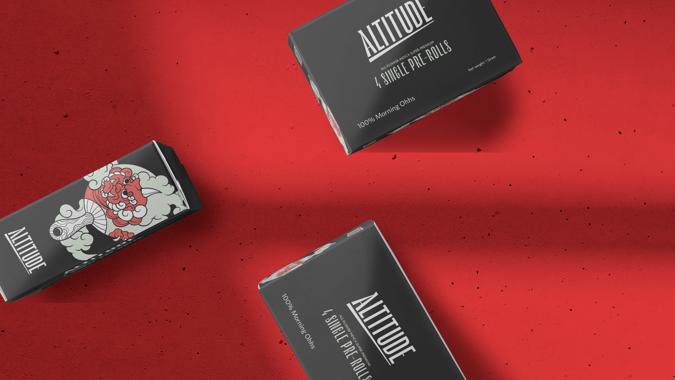
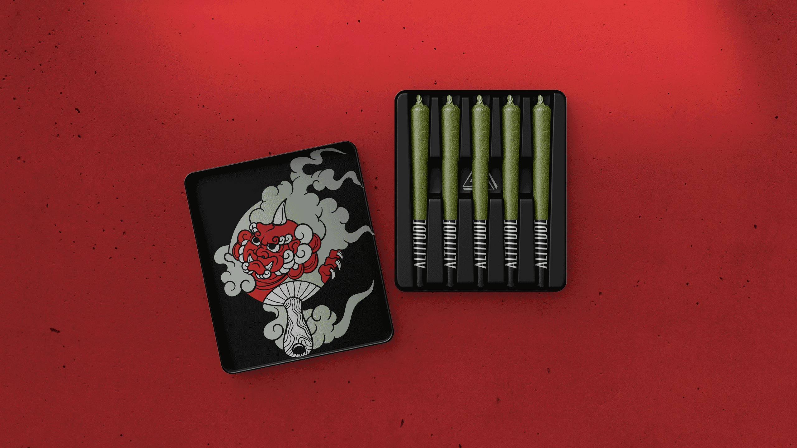
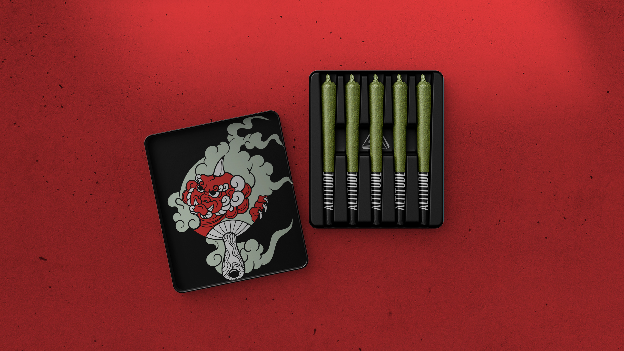
Each strain received its own illustration, drawn from the street art tradition of Detroit, Michigan, Altitude's hometown. The illustrations gave the product line a visual identity that felt rooted and specific.
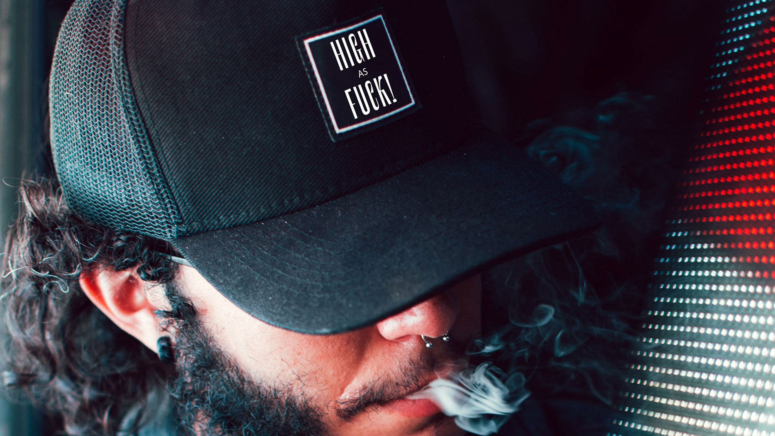
Community identity was central to the brief. The merchandise system reflects that. Casual wear and logo-free active streetwear give Altitude's community a way to carry the brand without broadcasting it.
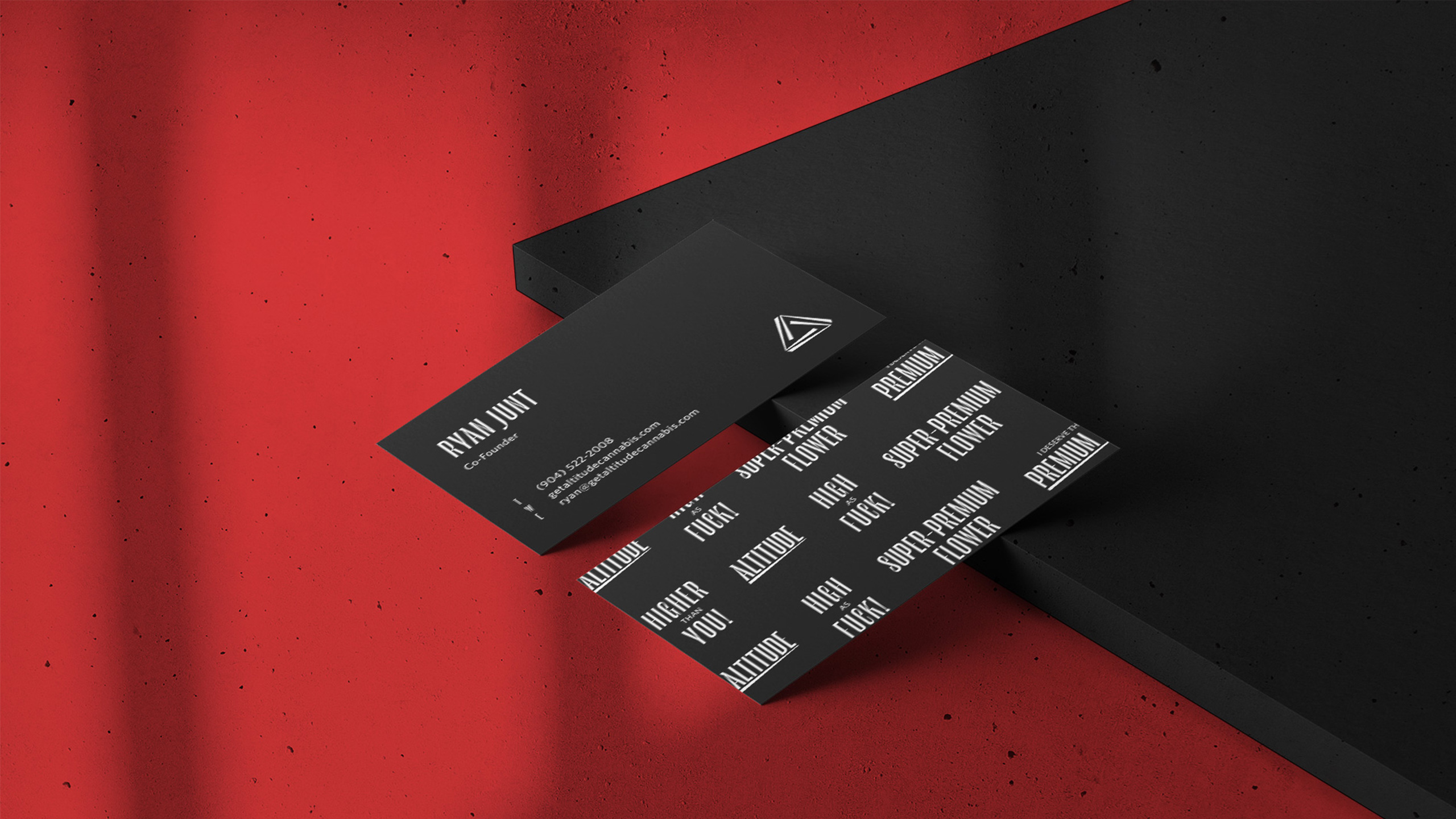
Every format, down to re-rolls and dog walkers, carries the signature black ground and custom tilted white logotype. Primary and secondary packaging meets tamper-proof requirements while preserving space for hero artwork. The system scales from the smallest SKU to full shelf presence without losing coherence.