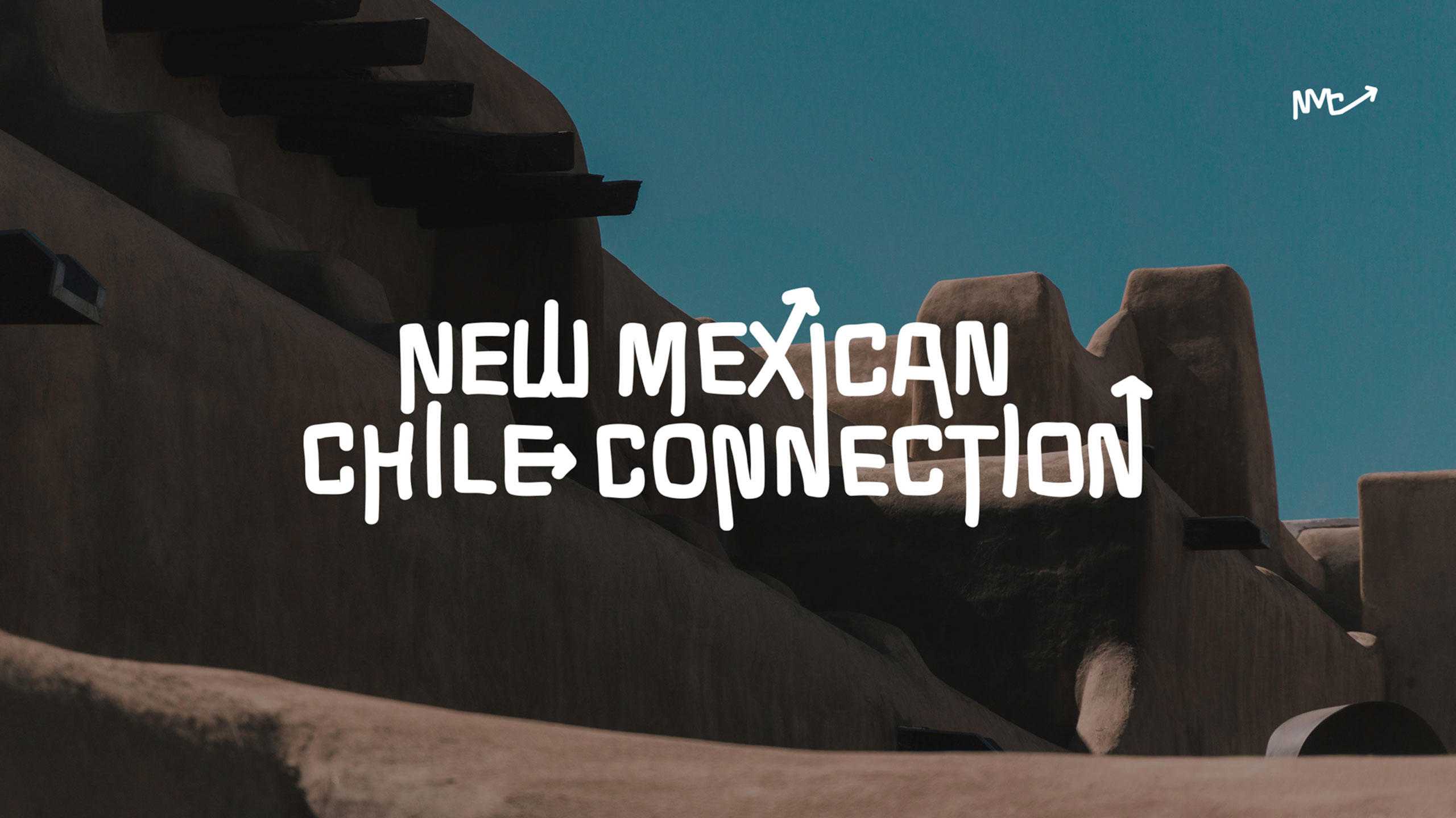
Branding & Packaging
A brand rooted in heritage, heat, and the soul of the Southwest.
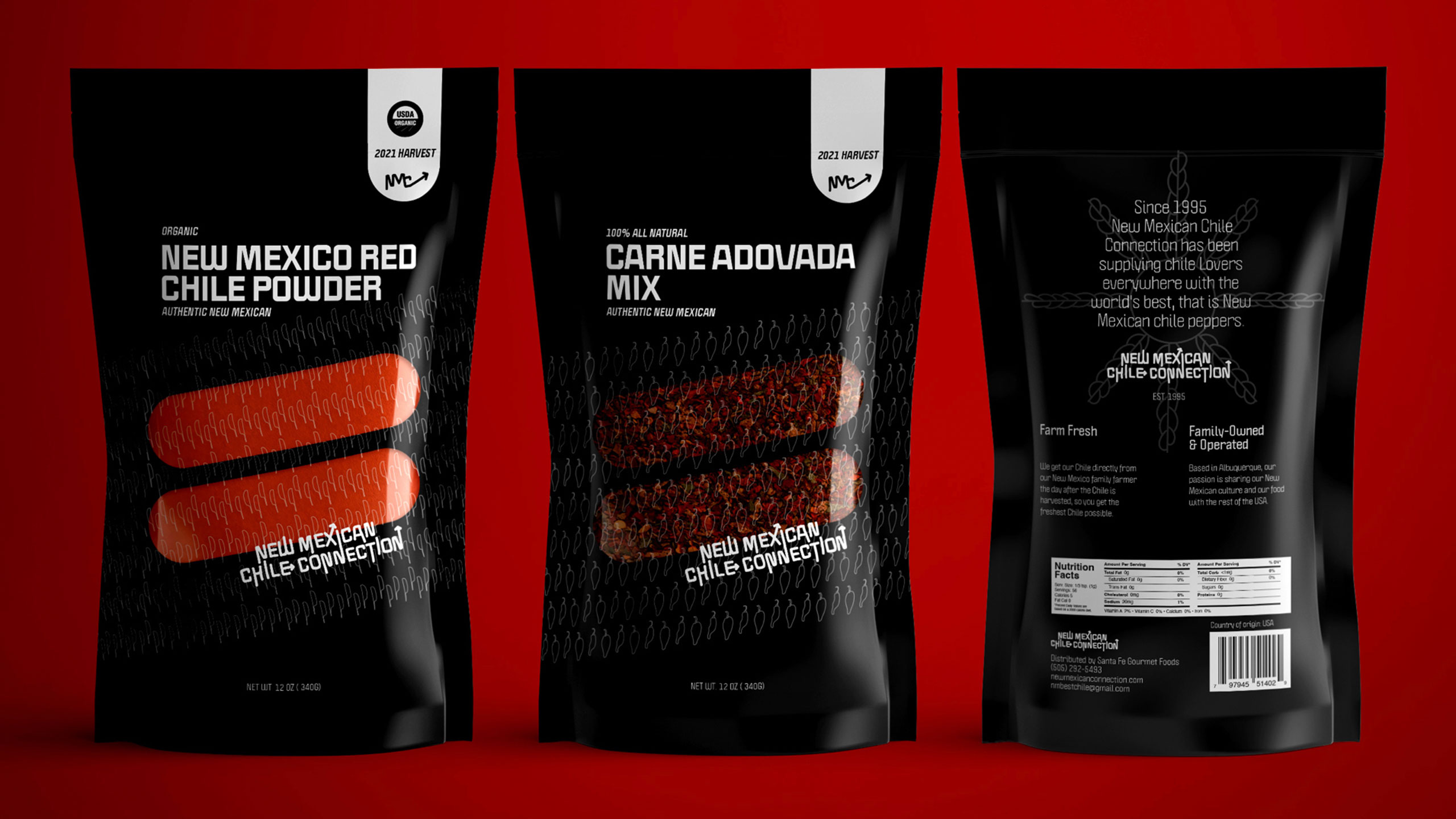
New Mexico Chile Connection packaging is usually a plastic ziplock bag. I made it a personal mission to change that. Born in New Mexico, I know that chile culture here is specific, proud, and deeply rooted in agricultural tradition. In two focused days, I developed a complete brand identity and packaging system, from visual research and logo sketches through final packaging, that captures the pride, warmth, and authenticity of the Southwest.
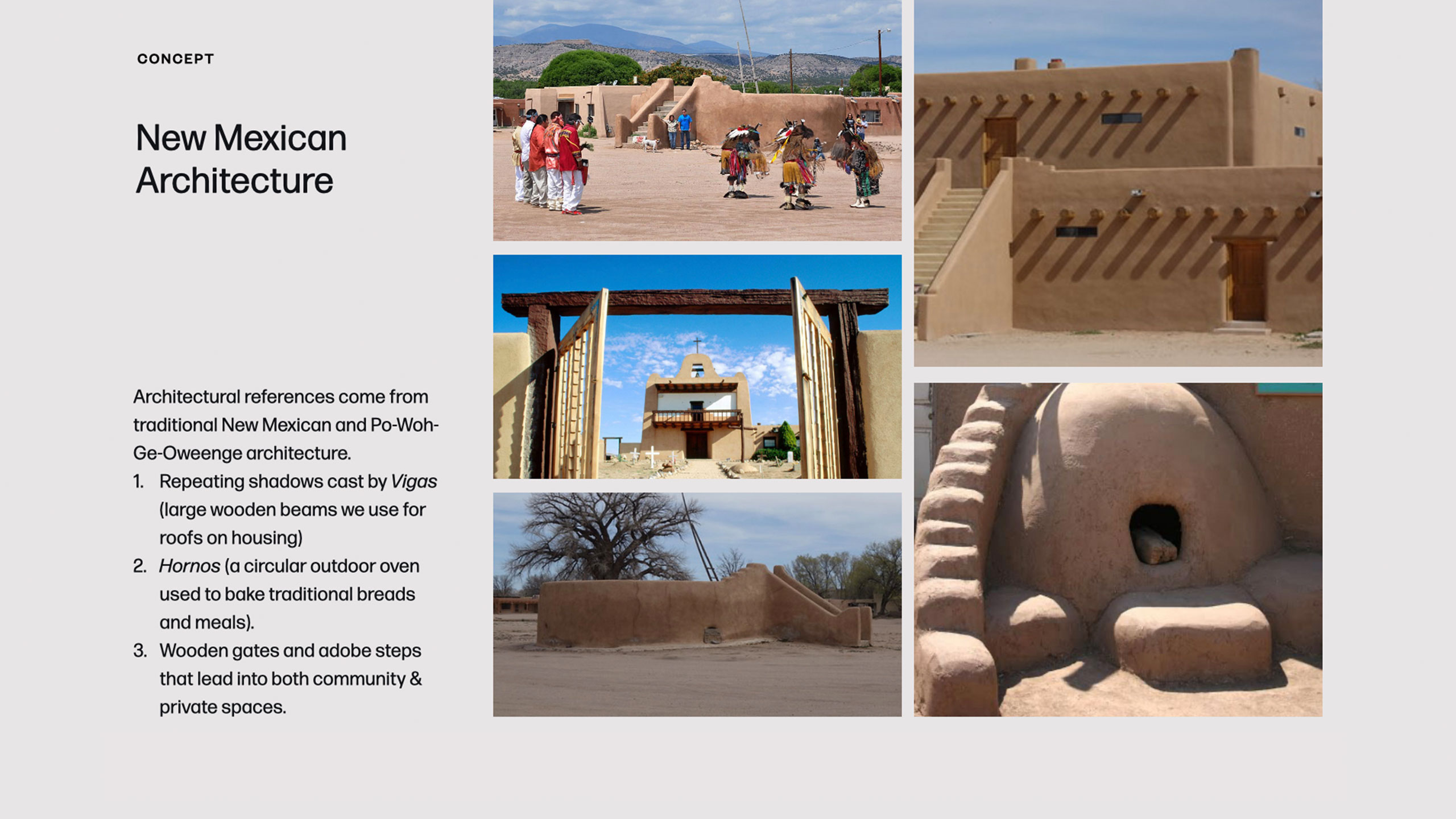
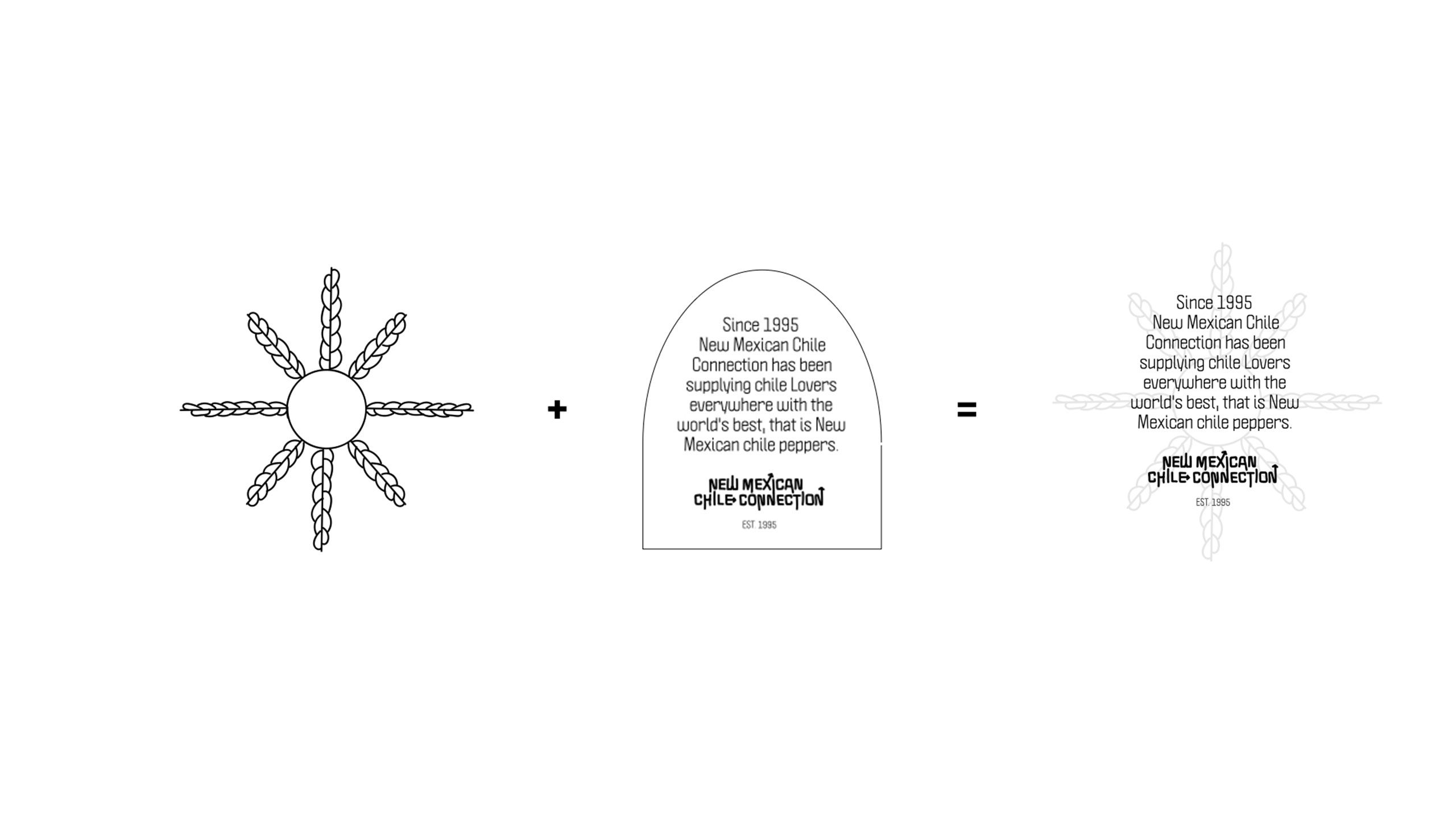
I started with deep visual explorations into New Mexican culture, folk art, and sacred agricultural heritage to find a direction that felt genuine to our beloved vegetable. The logo needed to feel handcrafted and warm, a mark that could live on rustic packaging and still read clearly at small scale.
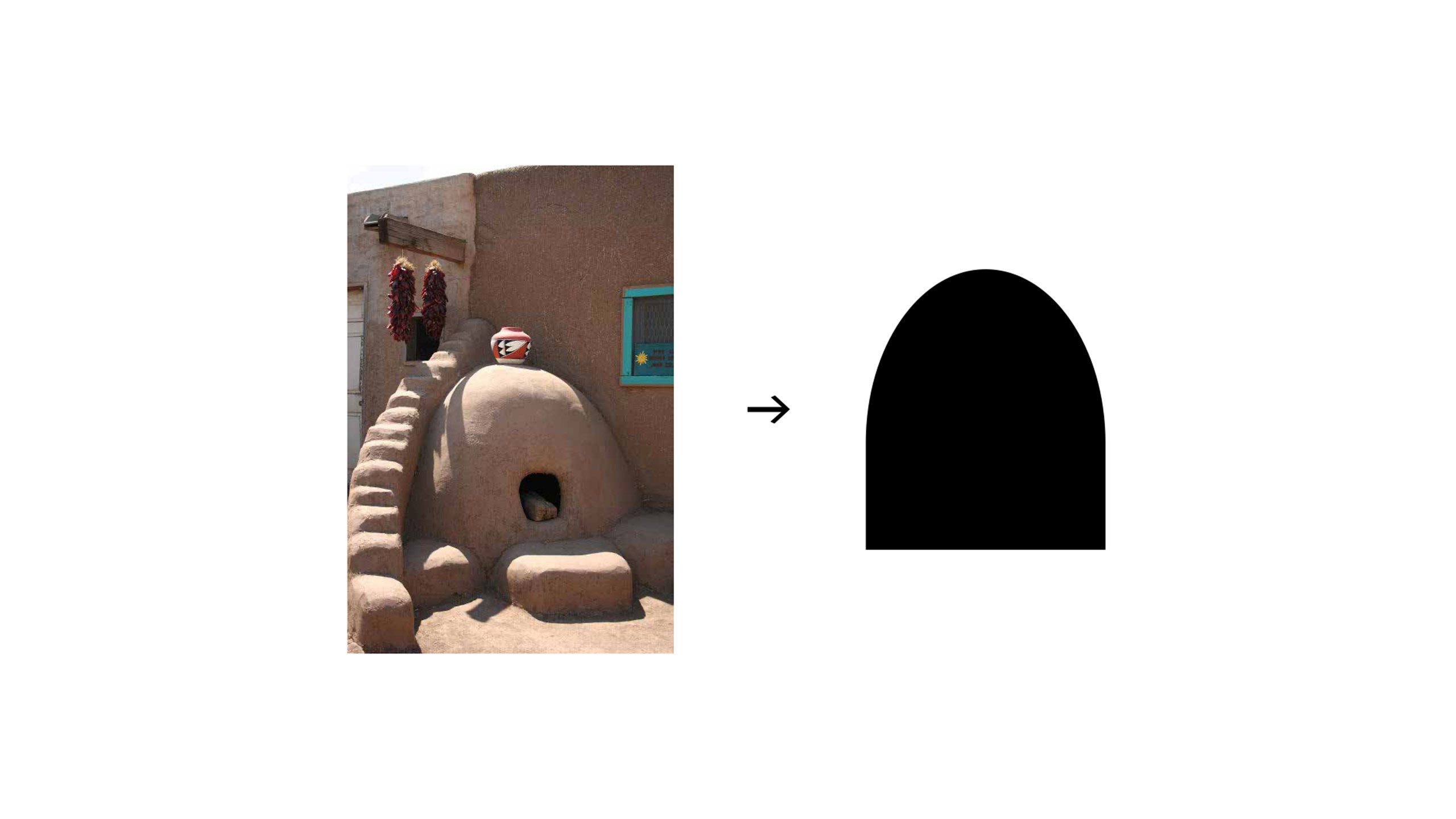
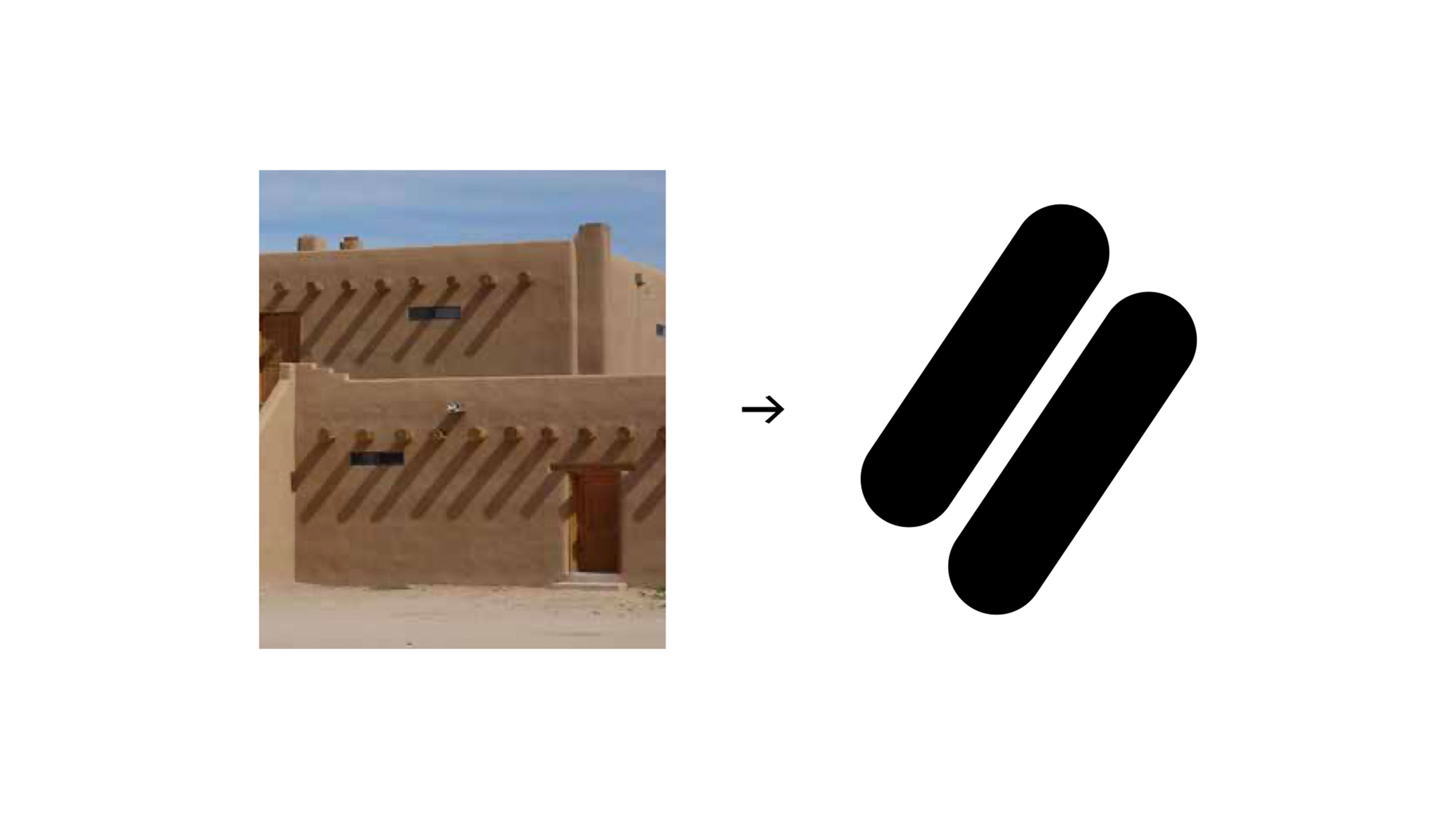
The packaging system was built around two ideas: the architecture of the chile-drying process and the storytelling power of New Mexican tradition. Each element, from the window device that lets shoppers see the actual spice blend, to the shape language drawn from the earthen cooking orno, to the narrative panels, gives the product a tactile, personal quality that communicates provenance and care. Not all chile blends are the same. The packaging communicates that, down to the yearly yield, because some harvests are spicier than others depending on rainfall.